|
Executive Editor

Join Date: Aug 2006
Posts: 29,160
|
|
 The Zune Review, Part 1: The Out of Box Experience
Note to the reader: when I first started working on this review, I had planned to tackle it all in one take, but given that there are so many other Zune reviews out now, I felt that I'd take the extra time to do a real "enthusiast" review where every detail is poured over. That means it will take longer to get the entire review finished, but I believe the level of detail and insight into the product will prove worth the wait.
The "OOBE" (Out Of Box Experience) is about the packaging and the presentation. Does the OOBE make you feel like you purchased something valuable and well-thought out? Or does it make you feel like you bought something cheap and of low value? When we see something in a plastic blister pack, we know it's not very expensive – when we see something in a richly coloured, finely detailed box, we have a different feeling about its value. I'll explore the Zune OOBE in a series of photographs, and as I unpack the box I'll take record my impressions about each step. And yes, I really did absorb the Zune this slowly - I didn't just rip open the box and start playing with it right away.
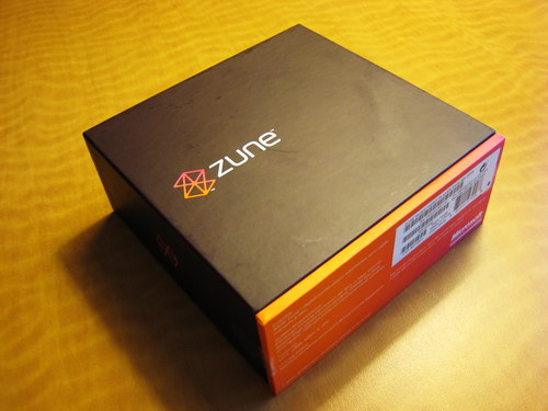
The Zune packaging is quite unique – I don't think I've ever seen any electronic device packaged quite like this before, especially not with the colours chosen. It almost looks more like a box for perfume than a digital media player. The package was much smaller than I thought it would be. There are many fascinating psychological studies about the intersection between perceived value and package size, but I think the Zune strikes a good balance. When I saw the small size of the box my perception of the value actually went up, because I was impressed with it being so small. The box has rich, deep colours, and the texture is smooth. It exudes quality.
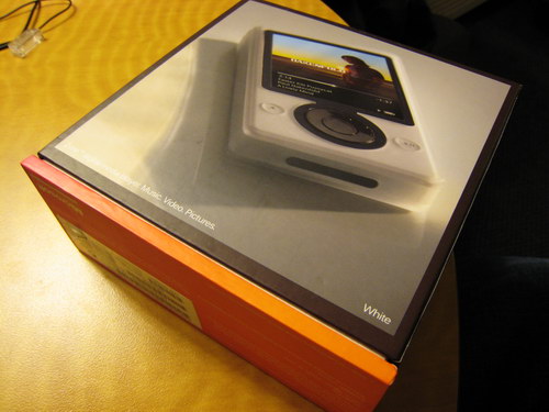
The rear of the box has a picture of the Zune, showing you the actual colour of the unit inside. It's interesting that Microsoft didn't use any "trick photography" here to minimize the apparent thickness of the unit – kudos to them for being honest about it. The Zune is dubbed a "digital media player", so I guess the category is DMP now. I like the sound of DMP better than PMP (portable media player), PVP (portable video player), DAP (digital audio player), or any of the other ones I've heard. The bottom of the box has the technical specifications, but they're kept fairly light: 30 GB, earphones, sync cable, manuals, and disc. I think they should have called it a "sync/power" cable, because people might not realizes it charges over USB, or think that it takes replaceable batteries of some sort. There are two plastic tabs that seal the box – you have to peel them off or cut them. Since I'm in a hotel room, and I left my Swiss Army knife/USB flash drive at home (airport security), I peeled them off without any trouble (although one tore the serial number sticker a bit).

After you slide off the top of the box – which is a strangely luxurious experience – you're presented with the "Welcome to the social" message. First-time Zune buyers will probably have no clue what this means. I think they should have gone with a more personal message like "Welcome to Your Zune" or something similar.
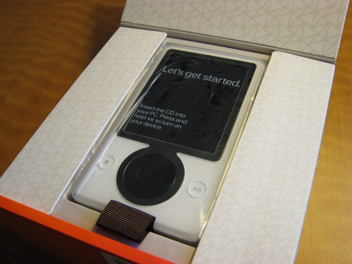
Flipping open the lid, you're presented with the Zune. There's a small sticker on the screen of the Zune that says "Let's get started – insert the CD into your PC. Press and hold play/pause to turn on your device". Rather than device, why not say Zune? It's more personal and less clinical sounding. There's a small fabric pull cord that allows you to easily pop the Zune upwards to remove. It's a small touch, but a welcome one. Again, the feeling here is one of quality and care.
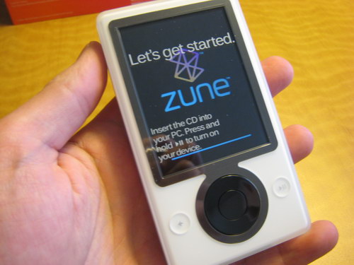
So what did I think when I first held the Zune in my hand? Well, never having seen in on person before, I thought that it was a bit taller than I thought it would be. The thickness was about what I had expected, which is to say that I knew it was thick, and being the owner of a Creative Zen Vision:M, I'm used to thicker DMPs. Given the physical size of the Zune, you'd think it would weigh more, which is why I think when people pick it up and compare it to an iPod they think it's lighter. The weight is fairly well distributed, and it rests easy in the hand.
The material that the body is made of is quite interesting - it's a smooth, hard plastic that is semi-translucent. I tried making a dent or scratch in it with my fingernail, but was unable to. For everyone that has had their iPod turn into a scratched-up mess 48 hours after they bought it, this is a real improvement. Not everyone likes the plastic though - it's definitely not as luxurious looking as the mother-of-pearl metal backing on my Zen Vision:M, and while it's fingerprint-proof body will likely stand up to abuse better than most players, to some people it still looks like a lab prototype that never quite got finished. The design isn't ugly by any means, but neither is it impressive. The cold, hard reality is that most people will compare the Zune to the iPod, and without seeing the user interface and focusing solely on the outer design, the Zune comes across as chunky, big, and dull-looking (especially the white one). A key factor in consumer acceptance is what some designers call "caressability" - do people want to pick up the device, flip it around in their hands, and play with it? Look at the way people treat some models of mobile phones and you'll see how this factor comes into play. The Zune doesn't exactly scream "caress me", and that's going to work against it. It looks like more a chunky PDA than anything else, partially due to the screen size - so in a way, that big screen works against it. Just look at the facial expressions of these news anchors when they first look at the Zune - it doesn't make a good first impression when turned off.
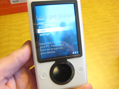
The three inch, 240 x 320 resolution screen is about what I expected - I own a Toshiba Gigabeat S, so I knew this was the same resolution and likely the same type of screen. I'll talk about the screen more later when I compare it to my Zen Vision:M, but it's not as vibrant or as high-contrast as the Creative product. The buttons are pretty standard affairs - as has been noted elsewhere, the pad in the center is not a scroll wheel like the iPod; rather, it's a four-way control pad. It's a bit strange that pressing up makes a louder sound that pressing down - the hardware "click" is much more pronounced.
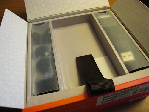
There are two cardboard flaps on either side of the Zune storage compartment, and flipping them up reveals two smaller compartments, each with components enclosed by frosted plastic sleeves.
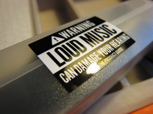
On the left we have the Zune headphones. There's a sticker on the outside stating "Warning: LOUD MUSIC can damage your hearing. Read the product guide". We have some whiny iPod owners who sued Apple to thank for this level of legal protection.
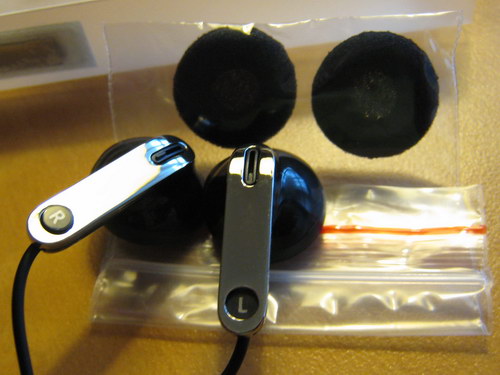
The headphones look like fairly standard affairs, although it's worth noting that they have small magnets on the outside so when stored together they click nicely. One set of typically hard to get on headphone covers is included – I'd like to have seen more, because while I won't be using these headphones regularly, many people will, and headphone covers get dirty.
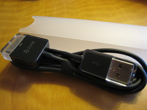
The right compartment contains the sync/charge cable. It's frustrating that the Zune isn't miniUSB-based (which would make it easy to recharge with any number of cables and accessories I have), but I know that an important part of a player's ecosystem is add-ons and accessories, so a custom connector wasn't surprising. Rather than having the cable tied together with one of those cheap not-quite-real-twist ties, the cable is secured with a paper fastener that has a small pull tab for easy removal. Again, attention to small details that makes the whole process painless. There are clear plastic caps on the end of each part of the cable, presumably to keep them from becoming dust and debris magnets.
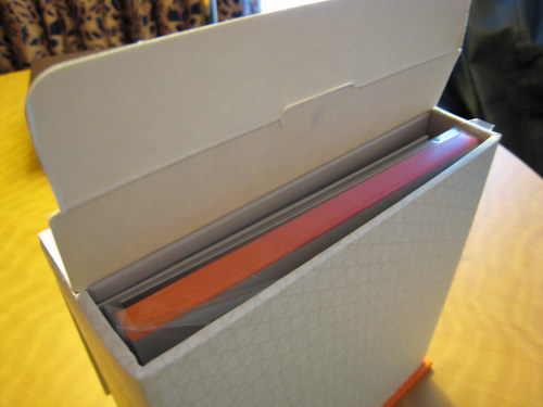
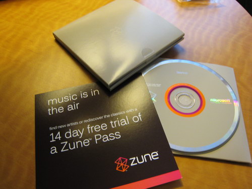
The other components are accessed via a flap on the rear of the main package, and inside I found a CD sleeve with a CD of the software inside it, a card with information about a 14 day free trial to Zune Pass (the $14.99/month music subscription service), and a grey folder with another one of those plastic tabs I had to slowly peel off.
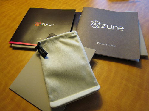
Inside the grey folder, I found the Zune Start guide, the Zune product guide, and what I'm going to call the Zune sleeping bag – a soft grey faux velvet/micro-fibre-like bag that's so form-fitting to the Zune I had a hard time getting the Zune into it.
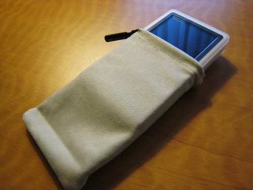
I guess it's meant to protect the screen, because when fully inserted the top of the Zune is still exposed, giving it little protection. There's a drawstring with a small plastic tag that says "Zune", but the bag is so tight there's nothing for the drawstring to…draw. The bag is kind of curious – it seems like it would be easier to use and more effective if it was just a bit bigger. At least the Zune comes with basic protection though – the Gigabeat S comes with nothing at all. The bag can also be used to clean the screen, which is a nice touch.
The Zune Start guide is blissfully short: load the software, connect the Zune when prompted (leave for up to three hours to recharge), and sync your content. One flap of the guide deals with the controls on the Zune: on/off, volume, next/previous, reset (press and hold the back button while pressing up on the control pad), etc. The Zune Product Guide is basically a collection of legal warnings to make some lawyer somewhere unhappy that his idiot client can't sue Microsoft for the car accident he gets into while driving and listening to a Zune.
That concludes the OOBE analysis: now it's time to install the software and plug the Zune in. Stay tuned for part two of this review.
Jason Dunn owns and operates Thoughts Media Inc., a company dedicated to creating the best in online communities. He enjoys mobile devices, digital media content creation/editing, and pretty much all technology. He lives in Calgary, Alberta, Canada with his lovely wife, and his sometimes obedient dog. He wishes he could have a cross between a Zune and a Creative Zen Vision:M.
|
 Similar Threads


 Threaded Mode