|
Editor Emeritus

Join Date: Aug 2006
Posts: 10,981
|
|
 Plugged In with the Samsung i320 Smartphone
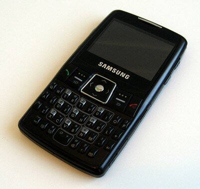
Product Category: Tri-Band GSM Mobile Phone
Manufacturer: Samsung
Where to Buy: Amazon.com [Affiliate]
Price: $540 USD
Specifications: Windows Mobile 5.0 for Smartphone, 1.3 Megapixel Camera with Flash, 65,536 Color TFT Screen, Push Email with Qwerty Keypad, microSD, Bluetooth, USB, IrDA
Pros:
[*]Measures in at just 111mm X 59mm X 11.5mm;[*]Great keyboard layout;[*]Loads of extra's.
Cons:
[*]Poor battery life;[*]Tri-Band (900, 1800, and 1900);[*]Proprietary connectors.
Summary:
The Samsung SGH-i320 Smartphone is gushing with potential. It's housed in an sleek and sexy black plastic body. It sports a QWERTY keypad for quick and easy text entry, a big and bright landscape display, Bluetooth with A2DP support, Microsoft's Direct Push email, and so much more. It's clear that Samsung put some serious thought and energy into building a powerful mobile device. However, it's not all peaches and cream with the i320. There is a dark side to this device. Is it bad enough to send this device packing? Perhaps there is a reason why the device ships with 2 batteries and an external battery holder/charging case.
Read on for the full review!
Taking a "Hard" Look at the Samsung
I don't think that anyone can say that Samsung wasn't thinking when they designed and built this device. It's one of the thinnest Smartphones on the market and it's not nearly as wide or tall as the Motorola Q. The phone has a strong solid feel to it, even though it weighs just 95 grams. It's so light and thin, that I forgot to remove it from my pocket when I passed through the airports metal detectors. I was pretty amazed at how easy it was to forget about the device resting in my pocket. The security guards were not as impressed. :?
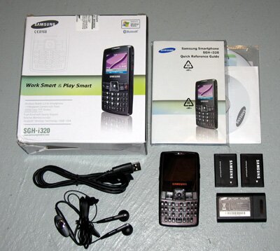
Figure 1: Here's almost everything you can expect to find when you un-box your i320. The wall adapter is missing from this photo. It was a little camera shy. 
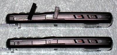
Figure 2: From the top to bottom we have the a Lanyard loop, Quick List/Key Lock key, Application launch key, Headset jack, and a Charger/Sync cable jack.
Along the right side of the device there are a number of important things. The first one that you'll find yourself using on a regular basis is the top most key. This is the Quick list or Key lock key. A quick press on this button and the Quick list is displayed allowing you to change the profile, turn on or off the device, toggle flight mode, or lock the keypad so that buttons aren't accidently pushed when you toss the device in your pocket. A long press on this key and it will jump right to locking the keys.  The next button down is what Samsung calls the Camera key. But in reality it can be any application. There is a small application in the device settings that will allow you to change the action for a short or long push on this key. I've set it up to launch IE on a short push and the camera on a long push. Next up is the headset jack and unfortunately, it's a proprietary connector. It looks very similar to a miniUSB connector, but it's not - trust me I tried. The last thing on this side of the device is the Charge/Sync cable jack. Just like the headset jack, this is a proprietary connector and it's a big connector too. I can't imagine that either of these two connector saved space over using the more standard miniUSB / 2.5mm connectors. While it's not the end of the world since there is an alternative (A2DP for stereo music playback over Bluetooth, and ActiveSync over Bluetooth) but it would be nice to be able to take advantage of our existing cables and accessories instead of buying new ones all the time. The next button down is what Samsung calls the Camera key. But in reality it can be any application. There is a small application in the device settings that will allow you to change the action for a short or long push on this key. I've set it up to launch IE on a short push and the camera on a long push. Next up is the headset jack and unfortunately, it's a proprietary connector. It looks very similar to a miniUSB connector, but it's not - trust me I tried. The last thing on this side of the device is the Charge/Sync cable jack. Just like the headset jack, this is a proprietary connector and it's a big connector too. I can't imagine that either of these two connector saved space over using the more standard miniUSB / 2.5mm connectors. While it's not the end of the world since there is an alternative (A2DP for stereo music playback over Bluetooth, and ActiveSync over Bluetooth) but it would be nice to be able to take advantage of our existing cables and accessories instead of buying new ones all the time.
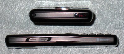
Figure 3: Across the top and down the left side of the device we have a IrDA port and the standard volume up/down keys.
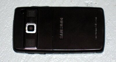
Figure 4: On the back of the device is the 1.3 Megapixel camera with flash, and stereo speakers.
The speakers on the i320 are pretty decent. While the sound quality is nowhere near the
Figure 5: Behind the battery door you'll find a nice clean layout with nothing hidden under the battery.
Under the battery cover you'll find unobstructed access to the SIM card. Unfortunately that's not the case with the microSD card. While it's not underneath the battery, like so many other Windows Mobile devices, it does require the removal of the battery to successfully insert or remove the card. It's not a deal breaker for the device, but it would have been nice if it could have been built to allow a memory card to be swapped without powering down the device.
Now we've come around to the battery. In my opinion the battery life is the single worst thing about this device. It's not really the battery's fault either. The battery is rated as a 1000mAh. For comparison, the HTC Tornado is rated as 1150mAh, the T-Mobile Dash is just 960mAh, and the Motorola Q is 1130mAh (Standard) and 1640mAh (Extended). Both the Tornado and Dash have significantly longer lasting batteries and the Q seems to be about the same life as the Samsung i320. So this isn't a battery size problem. My only thought is that Samsung didn't spend any time optimizing Windows Mobile to ensure happiness and longevity of use. According to Samsungs product page, the i320 is good for 3.3 hours of talk time and 140 hours in standby mode. I'm pretty sure the 3.3 hours of talk time is right. I don't know about the 140 hours of standby. On average a fully charged battery will last me anywhere from 20-30 hours. If I do a lot of talking or data then it's closer to 20. If I don't really use it much and it's goes about it's business doing email and data automatically then I'll get closer to 30 hours. If you're a heavy talker, then this could be the end of the line for you. It is within reason that someone could use up the battery in the middle of the day and be left swapping out. That is, if they remembered to bring the other battery along.
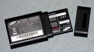
Figure 6: The spare battery comes with a handy little charge case. The light on the cable goes from red to green when the battery is fully charged.
While we're on the topic of power, it's worth noting that both the i320 and the Motorola Q have the same processor. They are both running an ARM920T PXA27x processor. Motorola claims to be getting 312Mhz out of this chip, but Samsung doesn't mention the speed of this processor anywhere. However, ARM and Wikipedia indicate that the processor should be around 250Mhz. Whatever the actual megahertz is, this device has a lot more pep than HTC's 200Mhz TI OMAP processors can pump out. It also has a lot less battery life, perhaps the two are somehow related.
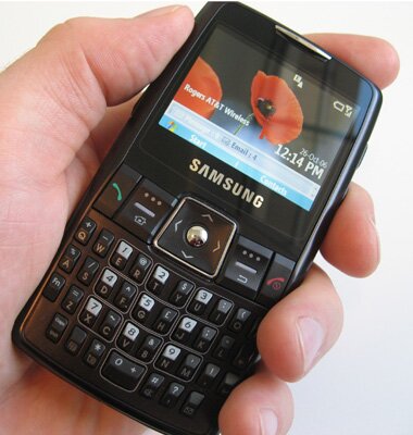
Figure 7: Samsung put some serious thought into this keypad. Pay close attention to the white line that surrounds the numbers on the keypad. They make it very easy for right or left handed people to push the dial pad keys during one-handed operation.
One of the key features of the i320 is its keyboard - all 37 keys. You'll be happy to know that all 26 letters from the alphabet are included, along with the standard 10 numeric keys. As one would expect, you'll find a backspace key, an enter key, a function key which will allow you to enter the value on the top half of the key and a shift/caps key. You'll also find 4 other special keys, all of which can be found along the bottom of the keyboard. There's a dedicated messaging button which will launch Outlook Mobile from any screen. The remaining 3 keys will only work under certain circumstances. The 123 key allows you to toggle input methods and this is only available when you're on a input field. The key to the right of that has a picture of paper with an arrow pointing up on one side of it. This key will pop up the input type menu allowing you to select symbols or even T9. When you press and hold the last key, the device will toggle your profile between the current profile and silent. This is a great way to quickly flip your device into silent as you enter a meeting. For whatever reason, it only works from the home screen.
That's all pretty standard stuff. What makes this keyboard so amazingly easy to use is how Samsung decided to layout the numeric keypad. In figure 7 you can clearly see a small white line around the E and R keys. Pushing either of these two keys will be accepted by the phone as the number 1. The same goes for the rest of the numbers - T or Y are considered number 2, U or I are considered number 3, and so on. So, if you're working the Start menu and need to push number 7 to launch your favourite calculator, you can push either X or C on the keypad. It works anywhere you would expect to use a numeric value. So if using SmartDial, or calculating the tip you should leave for your waitress at McDonalds, or maybe you feel like entering Pi to the 30th decimal place - you know, just for fun, then you'll love this feature. I'm sure all the lefties out there are applauding this decision too because it makes using the numeric buttons on the phone easy regardless of your hand preference. I never felt right dialing on the Q because the numeric keypad was shifted to the left side of the device. So your thumb had to stretch all the way across the device to push the numbers. Samsung has effectively centered the keypad making it a breeze for everyone to use.
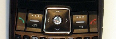
Figure 8: The navigation and call controls have all been assembled together in a line across the device. The softkeys are a little further from the screen than I would like, but overall it's a good layout.
The navigation control is a perfect size and shape for me. I find it really easy to navigate the menus or applications. Unlike some of the other Windows Mobile Smartphones, there's no chance of accidentally pushing a direction on the control pad when you actually meant to push in and select something. The Home key is shared with softkey 1 and the back key is shared with softkey 2. I would rather see these split into their own buttons, but to be honest, I haven't found myself pushing the wrong button by accident, at least not yet. The line between the top and bottom of the key will flash red when you get new mail or an incoming call. I've found this to be a great indicator when the phone is in silent and you want to be sure not to miss the next call. It would be nice if you could adjust the amount of flashing it does because it seems like a little too long. Currently it's 6 flashes per mail message or call. I would like to see it set to 3 or maybe 4 times. Again, this isn't a show stopper, it's a great feature, but it just flashes a little long for me.
All is not perfect in this small area of the phone. There's some little gremlin under the End key and the right softkey that seems to like to play games every now and then. I'm not sure if it's a faulty micro-switch or if it's just a matter of the side of my thumb pressing up against the End key when I try and push the right softkey. However, on occasion the phone will jump back the home screen when you're attempting to push the right softkey. By "on occasion" I mean once every 3-4 days. I spent some time being very careful about how I pushed those buttons to try and determine what the cause might be, but I wasn't able to find a solution. Doesn't happen all the time which makes it really hard to narrow down and determine the source. I would be interested to hear if anyone else has noticed this behavior too and what they've been able to determine.
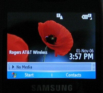
Figure 9: The number one compliment I get when someone sees me using the i320 in public is for the screen. It's bright, sharp, and a really beauty.
The landscape screen on the i320 has just as many pixels as the your standard Windows Mobile 5, QVGA, portrait screen, and just as many as the HTC S620. The screen is physically a little smaller at 2.2 inches compared to the 2.4 inches on the T-Mobile Dash. I'm not sure if the 0.2 inch difference would result in much of a change when it comes to image clarity. That will have to wait until I have both devices in my hand and can do a comparison.
It's clear that this device is a looker. I don't think you can honestly say this is an ugly device, especially when you put it next to a BlackBerry.  So with that in mind, how does it handle voice. In my opinion, very well. I have spent a lot of time using the speakerphone on this device and the sound quality has been excellent. I've also noticed that conversations seems more clear and people have been surprised to hear that I'm on a mobile phone and not in the office. This is my first time using a Samsung phone, so this might just be the standard for Samsung devices. I don't know. I can tell you that HTC could stand to learn a thing or 2 from Samsung when it comes to call clarity. So with that in mind, how does it handle voice. In my opinion, very well. I have spent a lot of time using the speakerphone on this device and the sound quality has been excellent. I've also noticed that conversations seems more clear and people have been surprised to hear that I'm on a mobile phone and not in the office. This is my first time using a Samsung phone, so this might just be the standard for Samsung devices. I don't know. I can tell you that HTC could stand to learn a thing or 2 from Samsung when it comes to call clarity.


Figure 10: Both of these images are un-edited. They are a copy of the original picture that has been resized down to display here. Click on the image and you can view the original unmodified image.
What can I say about the camera that comes built into this phone. Yes, it takes pictures and it even has a pretty cool multi-shot mode that allows you to snap 4 or 9 pictures with the push of a single button. The picture quality is about what you expect from a phone. It's not anywhere near the quality of the popular and pocketable point and shoot digital cameras. The i320's camera is listed as a 1.3 Megapixel camera with flash. To activate the flash, you simply press and hold the volume button. What I found especially interesting, is that you don't actually need to be in the camera application to turn on or off the flash. So I use it as a handy little flashlight. 
In regards to picture quality; I would say it's a little better than the i-mate SP5m, but I wouldn't say that it's something you should write home about. You can manage to get some nice pictures using a tripod, or by finding some way to steady the camera and a well light area. I use the camera as more of a toy than a way to capture those special moments in life. As I'm sure everyone else does too.
It's What's Inside That Counts
I'm sure it comes as no big surprise that this device is running Windows Mobile 5 for Smartphone devices. You'll also be happy to know that it has AKU 2.5 on it, which means you have the ability to do Direct Push email (via Microsoft Security and Feature Pack). However, that's nothing special, most Smartphones are shipping with that installed in ROM today. What is different is the extent to which Samsung customized things in this ROM. A large number of Smartphones on the market have little to no customization on them. If you've had more than 1 HTC device you'll know what I'm talking about - same old, same old. That's not the case here. Samsung has tweaked and added a number of things to make this phone that much better.
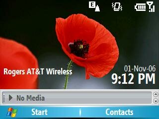
Figure 11: The first thing you'll notice when the device starts is the launch bar found across the bottom of the screen. The launcher bar keeps the home screen clear from clutter and still allows quick and easy access to important applications. Simply press up or down on the navigation pad to access the component you desire and then press action. Much like using any standard home screen.
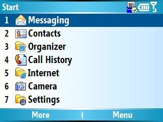
Figure 12: The Start menu and system menu's on the i320 allow for quick and easy access compared to the Motorola Q.
You might not notice the next change, but the Start menu is a little different. The options in the menu are listed using numeric values, where other QWERTY devices are using alpha values. Personally, I prefer the numeric values as they are quicker to locate and thanks to the special layout, easier to press. This can be found throughout the device. All the menus are listed with numerical values, just like your typical Smartphone. Samsung has added an option in the system settings to toggle the Start menu to the new large icon format, if you prefer that. The only issue is that there is no quick and easy way to select the application you wish to run. On a standard Smartphone you can press the number on the keypad that corresponds to the location of the icon in order to launch that program. However, that's not the case here. If you switch to the large icon view (by selecting Start / Settings / Display / Start Menu Style) then you have to use the navigation pad to move around the screen and select the desired application. :-(
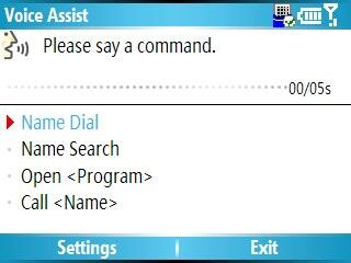
Figure 13: Voice Assist lacks the accuracy needed to be a reliable hands free dialing system.
One of the built-in applications is Voice Assist. You might be familiar with this from various Motorola based Smartphones. This is my first time using it and I have to admit that it looks promising but doesn't live up to its promise. I was attempting to demo this at a family gathering. I launched Voice Assist and waited for my queue and then slowly and clearly said "Call Mike Temporale" and VA quickly shot back with "Ready to dial work phone for Andrew Brown". How does Mike Temporale sound anything like Andrew Brown? I attempted this a number of times until everyone in the room had a good laugh. Then someone suggested that I try speaking in a British accent because VA was talking to me in a British accent. So I attempted it once more, and wouldn't you know it, the crazy thing worked! Now, I'm not that good with my British accent, but I get the impression that I'll get lots of practice if I keep trying to use this application. Just to show everyone how this works, I made a recording of me trying to use Voice Assist. Take a listen, and let me know your thoughts. Click here to download the audio clip.
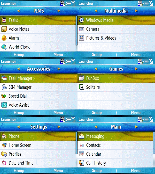
Figure 14: Samsungs Launcher application provides a quick way to find and run your favourite application.
When you press and hold the Home key for a couple seconds, Samsung's Launcher application will start. This handy little application allows you to navigate programs, settings, via groupings. You simply press left or right on the navigation pad to move from one group to the next until you find the group you're looking for. Then you can move up and down the list of applications to select the one of your choice. You have full control over the what groups should be displayed, in what order they should be displayed and what programs should be in each grouping. It's a pretty cool little application. I wish that they had set this to run when the device starts. It seems to me that this would be a really nice interface for the average business user that just wants quick access to their applications and don't want to fiddle around with making or installing a custom home screen.
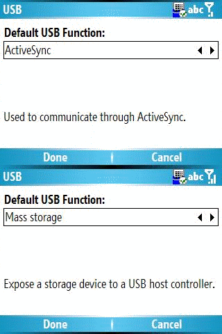
Figure 15: The Samsung i320 mass storage Smartphone.
Here's something that I wish more device manufacturers would put on their devices. Under Settings / Connections / USB you can toggle the connection type between the standard ActiveSync connection and that of a mass storage device. Why would anyone want to do that? Well, let's say you want to hook up to your machine at work and download a manual to share with a client, or transfer music/pictures from a machine that doesn't have ActiveSync onto your phone. This makes it really easy to do that. Also, given that a lot of people are going with Exchange sync, this gives you a way to move files onto the device without using ActiveSync. What I don't like about this feature, is that you still need that proprietary cable in order to do the transfer. So that means you have to carry around Samsung's special cable on the off chance that you might need to transfer files to your phone. If Samsung had chosen to use the more standard miniUSB then it would be less of a concern since these cables can be found in close proximity to almost any computer these days.
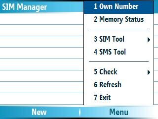 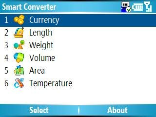
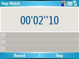 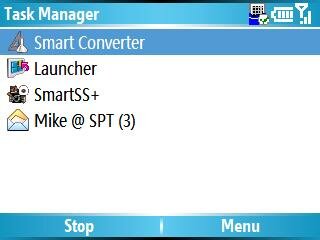
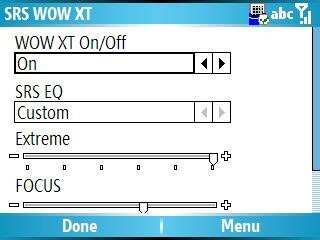 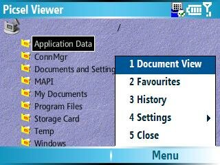
Figure 16: The Accessories bundle.
Samsung added more than just a couple extra applications on this phone. When you browse into the Accessories folder on the device, you'll see a nice selection of applications and not just the same boring old Calculator and Modem Link. Don't worry, they're still included, but you'll also find Samsung's Program Launcher (that we talked about earlier), SIM Manager, Smart Converter, Stop Watch, Task Manager, and settings for WOW XT. Further more, under the Organize folder in the Start menu you will find an Alarm application (capable of handling 5 different alarms), D-Day reminder application, and a World Clock. It's nice to see some simple extra applications included on the device. I like having these basics things loaded and ready to go on a new device. It's not like they take up a lot of room or anything.
Conclusions
Overall, the Samsung i320 is a great Smartphone and it's one that I'm proud to add to my collection. Sure, the battery life of the device is easily the worst of any Smartphone I have used, but it can still make it through the day without concern. As long as you can remember to plug in the device when you go to bed everyday, then you should be fine. I understand that it's not the most convenient scenario, but it's certainly not the end of the world either. The only other thing that I really don't like about this phone is the fact that it's just Tri-Band. I haven't noticed any increase in dropped or missed calls, but I can clearly see that reception in my most frequented areas has gone from 4 bars to 2 or even 1. I wish I knew why Samsung decided on going with just a Tri-Band setup for this phone. I can't imagine that adding the extra frequency would add much more in design, testing, or cost. Perhaps the extra frequency added a significant drain on the battery. :?  I think the i320 would find significantly more success if Samsung could find a way to increase the battery life and improve the Tri-Band configuration. The device is a dream to carry around thanks to it's small light weight design. I think the i320 would find significantly more success if Samsung could find a way to increase the battery life and improve the Tri-Band configuration. The device is a dream to carry around thanks to it's small light weight design.
Mike Temporale is the Managing Editor of Smartphone Thoughts. During the daylight Mike masquerades as an IT Consultant focusing on Business Intelligence and .NET solutions for Enterprise and large business. He spends his evenings with his lovely wife where they read Dr. Seuss books over and over again to their two hyperactive children.
__________________
"I have no special talents, I am only passionately curious" - Albert Einstein |


 The next button down is what Samsung calls the Camera key. But in reality it can be any application. There is a small application in the device settings that will allow you to change the action for a short or long push on this key. I've set it up to launch IE on a short push and the camera on a long push. Next up is the headset jack and unfortunately, it's a proprietary connector. It looks very similar to a miniUSB connector, but it's not - trust me I tried. The last thing on this side of the device is the Charge/Sync cable jack. Just like the headset jack, this is a proprietary connector and it's a big connector too. I can't imagine that either of these two connector saved space over using the more standard miniUSB / 2.5mm connectors. While it's not the end of the world since there is an alternative (A2DP for stereo music playback over Bluetooth, and ActiveSync over Bluetooth) but it would be nice to be able to take advantage of our existing cables and accessories instead of buying new ones all the time.


 Hybrid Mode
