|
Editor Emeritus

Join Date: Aug 2006
Posts: 5,074
|
|
 Motorola Q: The Trendsetter
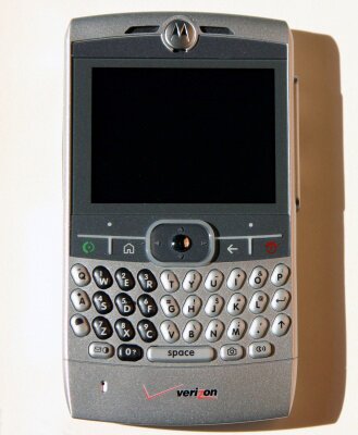
Product Category: CDMA/EV-DO based Mobile Phone
Manufacturer: Motorola
Where to Buy: Verizon Wireless
Price: $169.99 after rebates with a free Motorola Bluetooth Headset
Specifications: Windows Mobile 5.0 Smartphone; CDMA/1xRTT/EV-DO; 312 MHz Intel XScale PXA27x processor; 64 MB RAM, 128 MB Flash memory; 2.4-inch 320x240 65K TFT; External miniSD; Bluetooth; 1.3 Mega pixel Camera
Pros:
� Form factor - sleek, light, awesome looks;
� QWERTY keyboard;
� EV-DO;
� Scroll wheel and landscape screen.
Cons:
� Battery life;
� Scroll wheel and landscape screen;
� No headset supplied;
� No application for taking text notes.
Summary
Motorola Q is a trend setter, from its striking looks to its slim form factor that manages to pack in a gorgeous screen and a nice keyboard, this smartphone from Motorola is the latest buzz in town. It is the device every smartphone manufacturer is trying to emulate and is the kind of device every smartphone user wants to own. To do justice to this new comer in the smartphone world that is redefining the smartphone platform, we decided to assign the task of reviewing this unit to two of our editors, Jerry and Kris. Jerry has now been using the Q for a few months and Kris tested it out for a period of two weeks, and this is what they have to say about the Q.
Read on for the full review!
Out of the Box Experience
Kris: So Jerry when you got your review unit what made you rush to the Verizon store to get your own Q?
Jerry: As soon as I had the Q in my hand I could tell it was a good solid device. After playing with it for an hour I was hooked. I had to have one.
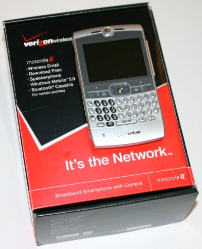
Figure 1: Boring packaging, but the inner beauty makes it worthwhile.
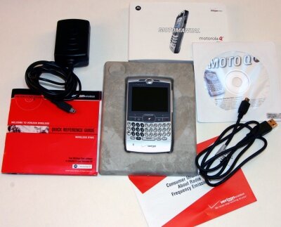
Figure 2: The package contains the basics: charger, sync cable, sync software, manual.
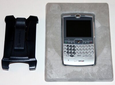
Figure 3: The bulky-plasticky holster; it's easier to carry the Q in your pocket. Looks like the Moto engineering department spent all the effort on the main unit, which they definitely got right.
Kris: Wow that is a totally different scenario compared to the MPx220's first impression. It is sad that such an amazing product has been packaged in a lack luster way. But on the other hand, Motorola is spending the packaging dollars in marketing and advertising this product. Not a day goes by without running into a print or TV advertisement.
Jerry: Talking about the packaging, where's the headset Motorola? Also, I hated the plastic holster. Motorola definitely kept the unit costs down by not including a headset and decent holster. I've seen some really good leather cases, like the ones made by Vaja.
Kris: Why do you need a headset, this isn't the MPx220. The Q has awesome speakers. The voice quality and the speaker phone quality has been the best ever, in my experience. The only other unit that I think comes close is the Motorola i930 for Nextel.
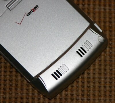
Figure 4: The two speakers at the bottom provide good quality stereo sound.
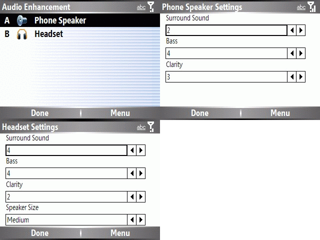
Figure 5: The bundled application to improve the sound performance.
Jerry: Starting with the actual case of the unit, that battery cover leaves a bit to be desired. It is thin and flimsy as is the extended battery cover. Not too much unlike the MPx220's was.
Kris: What about the other cover? How much time did it take you to figure out how to open the miniSD slot? I was so happy to see an externally accessible miniSD card slot. But in the time it took me to open the plastic dust cover, I could have turned off my 2125, removed the battery, inserted the miniSD card and the battery, and turned the power back on.
 
Figure 6: The left side of the unit with the IR port and the troublesome miniSD slot cover. The right side has the scroll wheel, the handy back button and the mini-USB connector. Note how Motorola is proudly displaying its name on the side.
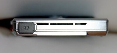
Figure 7: The top with head phone socket. This cover is relatively easy to open.
Jerry: Yeah, that drove me nuts too. I couldn't figure out which end of it to pull on first to open it. I ended up deforming the cover a bit. Did you notice that the unit does not have any dedicated volume buttons?
Kris: I realized that when I was watching MobiTV and wanted to lower the volume.
Jerry: OK we are sliding into a Motorola bashing session, which can be easy to do. This time they did it right. I am very impressed with the unit overall in spite of the few shortcoming we have talked about so far.
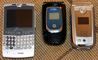
Figure 8: Third time lucky. The other Motorola Smartphones - second generation MPx220 on the right and first generation MPx200 in the middle.
Kris: Before I received the review unit, my thoughts were mostly negative. Just like you it was influenced by the past Moto products; but an hour after playing with the unit and getting acquainted with the keypad, I was totally enjoying the experience. Small things like the mini-USB connector for sync instead of proprietary Moto connector or the slim-USB like the HTC STRTrk make a big difference to the overall experience.
Jerry: I am dazzled by the keyboard. It is the nicest thumb board I have ever used. The buttons have a nice feel and good feedback. I never miss a key compared to my old HP6515, which had a horrible thumb board. The scroll wheel is really nice too. I rarely use the back button but appreciate that it is there. I have developed a rhythm with the scroll wheel and the Joypad/Action button. Using both I find getting around the menus etc. very quick and easy.
Kris: You're right we missed the best part - the scroll wheel. I was really looking forward to the scroll, and was glad that Motorola thought it through and added a dedicated back button on the side. Overall I wasn't too happy with the way Windows Mobile incorporated the scroll wheel. Before reviewing the unit I was under the impression that the Samsung i320 without the scroll wheel would be at a loss compared the Q, but now I know that it doesn't make much difference. Scrolling up and down, opening and closing mails can be done by using the scroll wheel and the back button; but when I have to open up the menu to delete or reply to the email, I have to access the soft keys. BlackBerry does a much better job at integrating the scroll wheel. I don't think the HTC Excalibur touch-strip can offer much relief either.
Jerry: You foolish man. Moto put a QWERTY keyboard and nice big landscape screen on this slim unit, can your BlackBerry claim that?
Kris: There are certain things that BlackBerry is good at. The Q definitely closes the gap between Windows Mobile and BlackBerry but there is room for improvement. Talking about the landscape screen, the screen is gorgeous, great for watching videos, reading emails, viewing photos and to some extent surfing. But again, Windows Mobile doesn't make good use of the landscape profile. The two bars - the icon bar at the top and the soft key menu bar at the bottom take up too much real estate.
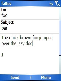 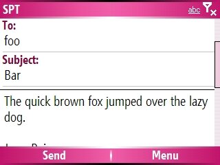
Figure 9: You be the judge; which screen layout is easier on the eyes. Landscape improves the left to right readability, but the icon bar and the soft key bar takes up too much space. Windows Mobile needs to be redesigned.
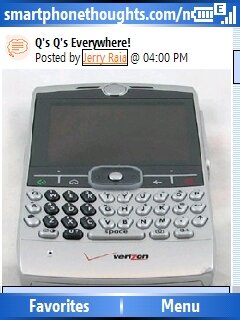 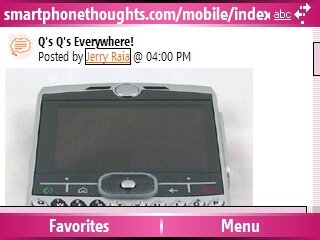
Figure 10: Another example of the landscape versus portrait screen real estate. This time with pocket IE screen shots. The vertical viewing area is definitely constrained.
Jerry: Good points. The screen is gorgeous. Sharp and bright but it can be difficult to use the home screen real estate in the landscape format. I did a bit of XML tweaking though and have it set up pretty well now.
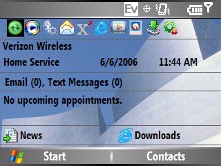
Figure 11: The home screen. The landscape layout is a challenge for the home screen designers.
Kris: Yeah, I too had to tweak the home screen a bit; I compressed the carrier name and date time information into one row, and got rid of the shortcut links. It is annoying when the profile, calendar items and email count are not visible on the home screen and you have scroll down to see the things you wish to check. I wish Motorola or Microsoft had spent sometime designing a landscape profile friendly home screen. That is one thing Orange is good at, all the Smartphones they have launched have customized home screens; all we get over here is wall papers and color themes. By the way Verizon's red color scheme is another thing that I had to change.
Performance - Usability
Jerry: The tiny size hides the power of the the EV-DO and the processor. Just surfing the Net and email is a real pleasure with the speed of the connection and the unit itself. Also the Bluetooth seems much more functional than Verizon's previous offerings. You can actually send any file from the Q to another BT device!
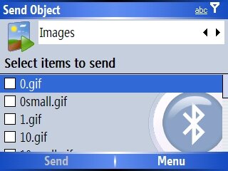
Figure 12: Bluetooth file transfer utility.
Kris: I never thought I would enjoy watching live TV or video on a Smartphone. MobiTV and Slingbox based streaming video works flawlessly. The screen is slightly bigger than the other Smartphones, and I think it is just the perfect size anything bigger would have added bulk and anything smaller would have made me squint. The sound quality adds to the complete experience. The twin speakers support SRS WOW surround sound and this time Moto definitely got the volume levels right.
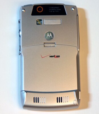
Figure 13: The smooth back with angled edges. The battery cover and battery can be replaced with an extended battery. Notice how it is slightly raised at the bottom, where the speakers are? The extended battery fills that gap.
Jerry: A note about texting here; the contours, the angled cuts on the back side make it easy to grip while using the thumb board.
Kris: I had trouble getting used to the keyboard, what about you? For me the buttons felt too stiff, but they do give good positive tactile confirmation when clicked all the way through. Again BlackBerry has better keyboards but the Q is definitely better than Palm's keyboard. Overall it was fun to hold the device, type a message and slip it into the pocket. About the pocket-ability, I wore a blazer to a party and was able to slip the Q into the inner chest pocket; no one could notice it. I could slip it into my jeans pocket as well.
Jerry: Getting back to the keyboard. I have two complaints. One, the numeric pad is not placed well for a right handed person. Holding the phone in my right hand my thumb has to stretch a bit to reach it for one handed dialing. It is a bit awkward. Two, this one caught me by surprise. I was dialing into a system that required me to enter data by alpha characters. You can't use the alpha keys as they don't send DTMF tones. I was staring at the numbers trying to figure out which letters were on them!
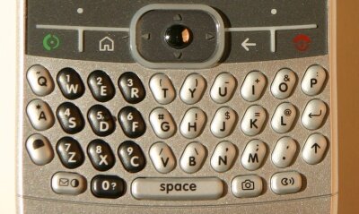
Figure 14: It can do QWERTY. The soft keys are big. The same is true for the home, back, call begin and call end buttons.
Kris: It drove me nuts too. I believe it is a bug and am hoping that Moto will fix it in the future. Talking about layout, I felt the soft keys were spaced too far apart; but the good thing is that they are wide. Again getting back to the keyboard, I felt the lack of copy - paste functionality on the Q more than with any other Smartphone. And why did they not provide a dedicated back button on the QWERTY key pad, I had to move my finger up to the main button area to hit the back button. This is something I noticed the Samsung I320 and HTC Excalibur have fixed.
Jerry: Instead they chose to add the camera button on the keyboard which is silly!
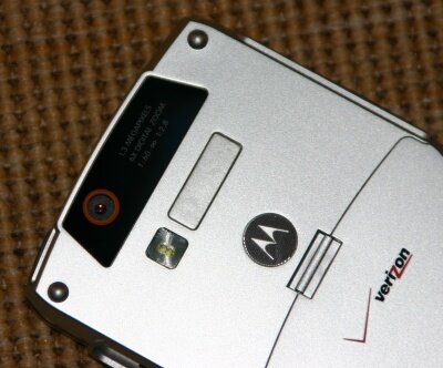
Figure 15: The 1.3 Mega-pixel camera with the stay-on LED flash. Love the styling.
Kris: Talking about Camera; the best camera experience ever in a Smartphone. Love the stay-on flash. Again the landscape screen makes it fun to view the photos.
  
Figure 16: Some sample shots taken with the Q. Click on the thumbnails for the hi-res images.
Jerry: I haven't taken too many pictures but the few I have were of decent quality.
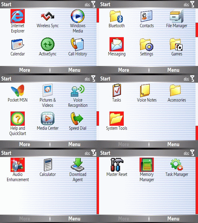
Figure 17: The Start Menu list.
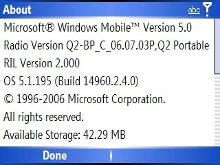
Figure 18: The About screen.
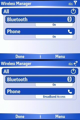
Figure 19: The new Connection Manager provided as part of the ROM update. The tabs show the status of each. Notice the Broadband indication when access is taking place.
Kris: One of the things that threw me off was that the Start menu program list is not paginated like in case of other Smartphones. All the applications are listed in one screen, the scroll wheel makes it easy to scroll thru and select the application; but how come the menu cannot detect key strokes and highlight the application? This seems like a bug, not sure if Microsoft is responsible or Moto? Also the order of the items in the Start menu is interesting, unlike other Smartphones the applications like Contacts and Messaging do not show up in the initial screen. You have to scroll to get to them. The good thing is that Messaging has a dedicated button.
Jerry: In the Settings menu did you notice A..B..C..D..E for the items instead of the traditional numbers? I think the alphabets on the QWERTY keyboard make it confusing; they should have stuck with numbers. Overall nothing is as annoying as the battery life on this unit.
Kris: Yeah, the Q is fast and responsive, the screen is awesome, the Internet access is super-fast but all good things must be balanced by something negative. In this case it is the battery life. I got a day's worth of use, and I had to charge it once I got home. Push email, videos and the Internet drained the unit fast.
Jerry: The extended battery is a must if you are a heavy user. While it adds a bulge to the lower back of the phone, it doesn't affect the pocket-ability of the phone.
Kris: We haven't talked about the bundled software. I know most of it is standard Windows Mobile stuff.
Jerry: Yeah, you get the standard Pocket Outlook with calendar, tasks, Office viewers, the standard Windows Mobile bundle. Nothing exciting.
Kris: Isn't it strange that this unit didn't have third party notes application? I know Microsoft does not provide text notes as a standard feature on Smartphone.
Jerry: Tell me about it! The unit has a keyboard and a notes application would make sense.
Kris: I installed OneNote Mobile Beta and loved the experience. Hopefully other QWERTY Smartphone manufacturers will include an application to take text notes.
Final Thoughts
Kris: Overall do you miss the hump-phone? How does it rate compared to the typical non-QWERTY Smartphones.
Jerry: I am no longer using the hump-phone, I have the clamshell 3125 now. I have found myself using the non-QWERTY Smartphone less and less, and the Q more and more. With all the texting and emailing I do, the QWERTY keyboard makes a huge difference!
Kris: What about the eternal debate about Moto's decision to go with the Smartphone OS instead of the Pocket PC? Do you think that by including the touch screen they could have made this device more powerful.
Jerry: No, I think a touch screen would have made it a two handed device and a bit more awkward to use.
Kris: I agree. Also the touch screen would have added to the overall cost; by keeping the production costs down, Moto and Verizon have been able to offer this device at a very affordable rate. Plus I consider the touch screen and the use of stylus a hassle; it slows down the single handed use. I do wish that Moto and Microsoft had done a better job at integrating the scroll wheel; I still am forced to use the softkey below the screen for the menus. Making the scroll wheel a rocking switch is one way to improve things.
Jerry: Rocking switch?
Kris: Like the scroll wheel you see on some desktop mouse. It lets you scroll up and down. You can push down to click but you can swing the scroll wheel to the left and right, usually to scroll the screen left to right. In case of the Smartphone, it can be used to trigger left and right soft key clicks. How does that sound?
Jerry: Awesome!
Kris: The other thing I wish it had and I have mentioned earlier is that it needs some text copy-paste functionality. I know there are some third-party applications that are available now, but the Windows Mobile OS needs to enable this functionality. The lack of Pocket PC OS is not felt, at least for me, because I don't edit any of the Office documents, I only view them when I receive some as an attachment; for that the viewers do a fine job, actually a better job than the actual Mobile Office applications. Actually for me more than the Pocket PC and Smartphone OS debate, I think that now Microsoft needs to improve the Windows Mobile platform to make better use of the keyboard, scroll wheel and the landscape screen.
Jerry: You're a cry baby! You can't ever be happy! ;-)
Kris: I know software and hardware take time to evolve. Motorola has certainly taken the hardware platform for the Smartphone to a new level; I think Microsoft has some catching up to do. I would like to see what they are doing for the next generation of Windows Mobile.
Jerry: Yeah, there is always the future. The good thing is that Moto released the MSFP update that enables the push email and remote wipe. The new ROM also takes care of a few issues. Flight Mode in settings has been replaced by "Wireless Manager." You can also now use the Q as a Modem, though it will cost you an extra $15 per month. Overall it is fun to watch the email arrive in the Smartphone inbox faster than the desktop's inbox. The QWERTY thumb-board and push email will definitely energize the Q sales and also popularize the Windows Mobile Smartphone platform in the CrackBerry world.
Kris: Hey, you know what? Moto released the update faster than our review.  It was a long wait but worth the wait. I love the push email and thanks to the QWERTY keyboard, I can send the response as quickly as I receive them. Now that I have returned the review unit, I must admit that I am missing the Q. I never thought I would like a device with a QWERTY keyboard because I always thought they would be big, plus I had seen all those executives who hold their BlackBerry, Treos or Pocket PC Phone Edition bricks to their ears and look silly. I never wanted to be one of them. Moto has definitely redefined the category; decent QWERTY, fast EV-DO speed, push e-mail and gorgeous screen, all in a super-compact and cool looking package, what more could I ask for? It was a long wait but worth the wait. I love the push email and thanks to the QWERTY keyboard, I can send the response as quickly as I receive them. Now that I have returned the review unit, I must admit that I am missing the Q. I never thought I would like a device with a QWERTY keyboard because I always thought they would be big, plus I had seen all those executives who hold their BlackBerry, Treos or Pocket PC Phone Edition bricks to their ears and look silly. I never wanted to be one of them. Moto has definitely redefined the category; decent QWERTY, fast EV-DO speed, push e-mail and gorgeous screen, all in a super-compact and cool looking package, what more could I ask for?
Jerry: How about the GSM version of the Q?
Conclusions
We enjoyed doing this review and hope you enjoyed reading it. As you can see we both like the Q and commend Motorola for taking the lead and being innovative, for taking the Smartphone platform to a new height. We will be seeing a lot of Moto Q wannabes in the near future but Moto Q will be remembered as the trend setter and one of the best in its class.
Jerry Raia is a Contributing editor for Smartphone Thoughts. When not flying airplanes he is playing with Smartphones and Pocket PC�s. He lives in Los Angeles, California.
Kris Kumar is a software engineer with expertise in Microsoft technologies and developer tools. He lives with his wife in Rochester, New York, USA.
|


 It was a long wait but worth the wait. I love the push email and thanks to the QWERTY keyboard, I can send the response as quickly as I receive them. Now that I have returned the review unit, I must admit that I am missing the Q. I never thought I would like a device with a QWERTY keyboard because I always thought they would be big, plus I had seen all those executives who hold their BlackBerry, Treos or Pocket PC Phone Edition bricks to their ears and look silly. I never wanted to be one of them. Moto has definitely redefined the category; decent QWERTY, fast EV-DO speed, push e-mail and gorgeous screen, all in a super-compact and cool looking package, what more could I ask for?


 Threaded Mode