 Awful Looking Text Over HDMI on Your TV? Turn Down the Sharpness
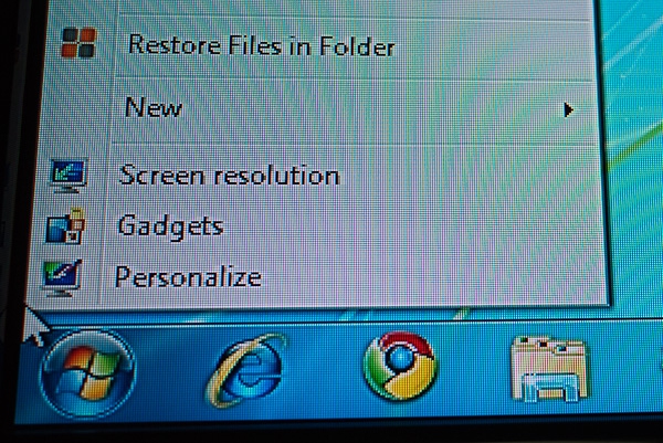
Are you seeing awful-looking text on an LCD or plasma TV after connecting your laptop or desktop to it via HDMI? Here's a tip that might help. First, some back story... A couple of weeks ago, I swapped out video cards in the desktop PC that I use as my Windows Media Center computer. A few months earlier, I'd removed my aged Dell 26" 720p LCD TV and replaced it with an LG 32" 1080p LCD TV. I was running over DVI, using a DVI to VGA adapter since the LG TV didn't have a DVI port. Everything looked great, though I wasn't sure if I was really seeing 1080p resolution when I was watching Blu-ray movies - the NVIDIA 7950GT video card was a couple of years old, and I wasn't sure if it would support HDCP over DVI > VGA. I spent a few hours trying to determine if I had an HDCP-compliant chain of devices (computer to video card to display) and found it impossible to find anything that allowed me to easily test this. I'd already purchased the new video card - a low-end, passively cooled ATI 5000 series Radeon card - so I figured "What the hell, I'll just put it in". The new card had HDMI, so of course I wanted to use that to drive my LCD TV. I connected it, booted up Windows, and was aghast at how awful things looked. The resolution was fine - it was pumping out a full 1920 x 1080 signal - but the text and icons looked awful. The text was hard to read, and the icons looked terrible. There was a weird "ghosting" effect around the text as well. 
Figure 1: The text and icons before my adjustments. I was completely baffled by this, so I spent the next hour swapping cables and searching for clues online. I discovered that when I connected the TV to the video card via VGA, things looked great...but when I switched to HDMI, they looked awful. I checked everything on the computer that I could check, then it occurred to me that I should check the TV settings themselves. Imagine my surprise when the default sharpness setting on the HDMI input was set to 70, and the default sharpness on the VGA input was set to 40. Bing! 
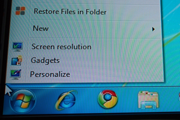
Figure 2: The text and icons after making the sharpness adjustments. As soon as I started to turn the sharpness down, the text lost the "halo" effect around it, and so did the icons. I set the sharpness at 50, and my problem was solved. Oh, and it turns out that I wasted my money on the new video card - I was seeing 1080p all along...and I'm frankly not sure why I didn't realize it, because it's pretty obvious when high-definition content gets down-scaled to standard-definition. My ignorance of HDCP led me to believe I could somehow improve what I was seeing by getting the new video card - lesson learned! Jason Dunn owns and operates Thoughts Media Inc., a company dedicated to creating the best in online communities. He enjoys photography, mobile devices, blogging, digital media content creation/editing, and pretty much all technology. He lives in Calgary, Alberta, Canada with his lovely wife, his wonderful son, and his sometimes obedient dog. Sometimes he wastes money on technology that he shouldn't. 
Do you enjoy using new hardware, software and accessories, then sharing your experience with others? Then join us on the Thoughts Media Review Team! We're looking for individuals who find it fun to test new gear and give their honest opinions about the experience. It's a volunteer role with some great perks. Interested? Then click here for more information. 
|