
10-21-2009, 04:37 PM
|
|
Executive Editor

Join Date: Aug 2006
Posts: 29,160
|
|
 Leaked Windows Mobile 7 Screen Shots? Maybe...
"We've seen the 6.5.1 leaks from WMExperts today that combined TouchFLO 3D and 6.5.1 together into a tidy package along with the leaks of the Windows Mobile 7 mockups earlier. Now, our very own tipster has delivered some exciting additional screenshots to pocketnow.com, giving us a peak of the Call screen, Calendar, Contact, Email, Text Messaging, and Settings!" 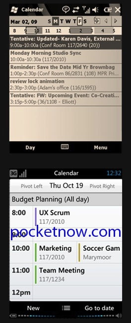 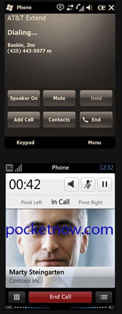
pocketnow.com has gotten their hot little hands on some screen shots that show a very different sort of Windows Mobile. So is this Windows Mobile 7? Hard to say - all I do know is that I'm liking what I'm seeing.
|
| |
|
|
|
10-22-2009, 12:29 AM
|
|
Thinker

Join Date: Aug 2006
Posts: 359
|
|
I think these pics are legit and look very good. But, I really hope there are options we can change to display more details for items. That wouldn't be very functional for me.
Notice how the email app doesn't show the date and time received, and the calendar app doesn't show "snippets" of the details (something I really like in the current WinMo). As long as we'll have the ability to switch to a more detailed list view of sorts for Contacts, Email & Calendar items, I'll be happy.
|
| |
|
|
|
10-22-2009, 02:23 AM
|
|
Neophyte
Join Date: Oct 2009
Posts: 1
|
|
I don't see the big difference from 6.5 and this seems to be keeping the same 6.5 style with the X or OK on top right. If you check out this article which claims to be version 6.5.1, you will see a new design where things are moved to the bottom of the screen with larger OK button. So something isn't adding up here:
http://www.t3.com/news/windows-mobil...-corner?=41547
|
| |
|
|
|
10-22-2009, 04:22 AM
|
|
Ponderer
Join Date: Jul 2004
Posts: 68
|
|
Will we have to use our pinkie to change the volume?
|
| |
|
|
|
10-22-2009, 04:53 AM
|
|
Thinker
Join Date: Aug 2006
Posts: 359
|
|
Quote:
Originally Posted by superrrguy

Will we have to use our pinkie to change the volume?
|
ha! I was thinking the same thing when I looked at. Not sure how that will work. Being that Microsoft is trying make things more "finger friendly" and bigger I would think the current way would be easier, but who knows without using it.
|
| |
|
|
|
10-22-2009, 07:55 PM
|
|
Theorist
Join Date: Aug 2006
Posts: 276
|
|
I hope this is not Mobile7, I still see the need for a stylus...
|
| |
|
|
|
10-23-2009, 01:50 AM
|
|
Intellectual
Join Date: Aug 2006
Posts: 160
|
|
Quote:
Originally Posted by superrrguy
Will we have to use our pinkie to change the volume?
|
Its just an indicator. There is probably a popup. MS should require devices have volume up/down buttons anyway.
|
| |
|
|
|
10-23-2009, 02:52 AM
|
|
Ponderer
Join Date: Jul 2004
Posts: 68
|
|
Quote:
Originally Posted by JKingGrim
Its just an indicator. There is probably a popup. MS should require devices have volume up/down buttons anyway.
|
In theory, yes. In theory.
|
| |
|
|
|
10-23-2009, 05:16 AM
|
|
Neophyte
Join Date: Apr 2009
Posts: 7
|
|
i'm surprised you're liking what you see cause it looks like a joke to me.. they're adding more and more stuff at the top and bottom of the screen on a small handheld device so the space that's left is so tiny...
this might have been cool when they first thought up WM7... but things have come a long way since then. If they're smart they'll actually LEARN from HTC, Andriod, and the Iphone and come out with an actually usable intuitive interface.
|
| |
|
|
|
10-23-2009, 12:47 PM
|
|
Ponderer

Join Date: Jun 2007
Posts: 58
|
|
that first pic of the calendar looks the same as it has for years, and not very finger friendly....
|
| |
|
|
|
|
|
|


 Linear Mode

