
10-10-2009, 03:00 PM
|
|
Executive Editor

Join Date: Aug 2006
Posts: 29,160
|
|
 WMExpert's Take on Windows Mobile 6.5
"We've had access to a Windows Phone running an official Windows Mobile 6.5 build for a few days and found it to be an impressive, stable, responsive operating system. Windows Mobile 6.5 is graphically enhanced with the new Today Screen, colorful icons (or widgets as the youngsters call them) and an overall improvement over Windows Mobile 6.1." 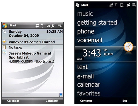
WMExperts has published their review of Windows Mobile 6.5, and they've done a good job of comparing the old and the new, side by side. The new 6.5 interface is certainly prettier, but looking at the above screenshot, you can't help but notice that there's less information presented. Sure, the lock screen will show you your next appointment, but one of the things I've always liked about the Today screen is the amount of information available at a glance. I suppose this evolution is inevitable, as anyone who's used HTC TouchFlo 3D has gotten used to having less information presented on the home screen. I was reading through some of the comments posted to the WMExperts article, and it got me wondering how many bugs and limitations have been addressed in Windows Mobile 6.5. Has the multi-computer sync story gotten any better? Has there been any improvements to Windows Mobile Device Center? I suspect the answer is "No" in most cases - I think Microsoft is so focused on cloud sync (read: Exchange Server) that they've forgotten that some people still want to connect the phone to their computer.
|
| |
|
|
|
10-10-2009, 06:02 PM
|
|
Sage
Join Date: Aug 2006
Posts: 667
|
|
This is more of an advertisement than a review; I kept checking to see if I'd been redirected to microsoft.com. While the side-by-side thing is interesting, it would be nice if they were a bit objective. And I had to laugh at their attempts to actually explain the logic behind MS changing the name! Where have they been the last decade or so as we've been through Windows CE, Palm-sized PC, Pocket PC, and Windows Mobile? Of course MS changed the name... it's easier to do than to actually create a compelling, leading-edge product.
What this article really highlights is how superficial the changes to the UI are and how we are trading off functionality for asthetics. It doesn't have to be a tradeoff, as others have already shown, but that's what it is here. I mean, come on... you can't even order the icons in your home menu? What have they been doing for an entire year?
I am constantly amazed that a company as big as MS can't do better on the interface. When I consider our UI options on WM/WP -- Titanium (6.5), Touchflo 3D, Touchwiz, SPB Mobile Shell -- this is by far the least impressive effort of the bunch. MS needs to fire all of their UI people and just contract SPB to design their UI.
I've just ordered a new Windows Phone 6.5 (Verizon Imagio) and there is really just one thing about 6.5 that I'm looking forward too. Everyone says that 6.5 is smoother and more responsive to touch than 6.1. Now that's an improvement. And a few of the included apps will probably be nice. But that's about it. For the UI, I'll be choosing between Touchflo 3D and SPB Mobile Shell as my UI. Titanium isn't even in the running.
|
| |
|
|
|
10-10-2009, 07:38 PM
|
|
Pontificator
Join Date: Feb 2002
Posts: 1,043
|
|
I've been using WM6.5 for many months, a number of small variants thanks to dsixda of xdadevelopers fame. And I have tried using other Today screens, but always come back to Titanium (as trimmed down a bit thanks to another xdadev offering; CHome Editor). Not entirely 'happy' with it exactly. More a matter of thumbable convenience over depth of functionality. On my current phone, an HTC Elfin, the screen is only 2.5". That is small. Cramming a bunch of small text onto the Today screen doesn't really work for me on such a small scale. The Calendar panel for instance shows only the next two appointments, one by default, the other accessed with a thumb swipe sideways. For the Weather panel I get a few days of basic predictions by default, then sideways swipes get me a more detailed breakdown of each day. The clock is just the clock, but at least it shows a large enough time that it's readable at a glance. I use a Fave People plugin with a few contacts entered for quick dialing from Today, again easy to flip through with a thumb. Voicemail and Gmail are accessed via their little panels.
And that's all I use. That short list, as edited by CHome Editor, means all my Today panels are shown at the same time, always, no scrolling to see any more. Of course some users prefer to scroll a lot, but my experience has been that if it's not displayed when I turn on the phone, I'm not going to waste time scrolling to find it, but rather take the step of launching an application via start menu. Which... well, it took some work to get that organized in a usable way. Subfolders are a big help, with just a half-dozen most used application shortcuts up along the top. The options of Move To Top and Move Down options in this menu are very limiting, but with some planning can be worked with successfully. I just envisioned what order was preferred for me, in terms of frequently needed access, then started moving the LEAST used items to the top first. Carrying on to end up moving the MOST used items to the top last resulted in a correct ordering of shortcuts and folders. There, a nicely ordered shortcut heirarchy! Took some work, but once it's done there is nothing more to think about. When installing a new program, just move the shortcut out of the \Windows\Start Menu\Programs folder and into a sub-folder. There is no possibility for ordering in the sub-folders (as Move To Top results in the shortcut 'virtually' moving outside the sub-folder into the root Start Menu folder), so one must accept the rather arbitrary ordering there. Not nice, but with some diligent planning in the categorized sub-folder names it's usually not difficult to find a wanted application.
If this were a bigger phone I may well go back to a more old school Today display. Not sure until I get a bigger phone. Maybe I'm too addicted to the speed of thumbable use to go back to hunting around with a stylus. I would like more user-defined options, such as enabling a half-dozen or more appointments displayed in Calendar's representation in Titanium. But that will probably come, as more users get WM6.5 in their hands and complain in forums and get Microsoft waked up enough on the issue to actually do something about it. Maybe with WM7 we'll see a built-in Titanium editor, something a bit more intuitive (and safe) to operate than CHome Editor, which is frankly daunting to use in any depth.
As for other elements of WM6.5, my opinion after 6+ months of use is that it is a modest improvement over 6.1. Stability is enhanced a little maybe. I like the system-wide scrolling for the most part, though it'd be nice to be able to toggle it somehow, for example when wishing to multi-select rather than to scroll. But there are workarounds for such quibbles, not a huge deal. My biggest complaint is with Pocket IE. Microsoft has changed PIE quite radically, making it so close to unusable that I just don't bother. And that's a shame, as there is a lot worthwhile about PIE in my opinion. But the view options have been reduced to an absurd degree, such that most websites are loaded zoomed out so that text measures just a few pixels in height, not readable at all, and a several-step zoom sequence must be tapped/dragged through just to be able to read a page. It's jumpy as heck, often showing strange blank places on a page once zoomed correctly so it's anyone's guess where on the page is being displayed. A lot of thumb-scrolling is needed to find anything. In the same amount of time it takes for a typical page to load I can load several tabs in NetFront, so that's been my default browser for some time. It seems odd that with Microsoft's prior disposition towards making the browser a central element of these devices, it has now been subverted to the point where Opera is being put in by the OEMs, just to keep customers happy. That was never before necessary.
__________________
Gerard Ivan Samija
|
| |
|
|
|
10-11-2009, 01:06 AM
|
|
Ponderer

Join Date: May 2006
Posts: 88
|
|
the WM team must be copying or the same bunch of people from HTC TouchFLO3D!
The TASK is totally gone from the TODAY 's screen / lock screen !
Although I can change a task to become a ALL day even on calender, but it's just not the same... 
|
| |
|
|
|
10-11-2009, 11:08 PM
|
|
Thoughts Media Review Team
Join Date: Aug 2006
Posts: 749
|
|
Quote:
Originally Posted by UCCOFFEE

the WM team must be copying or the same bunch of people from HTC TouchFLO3D!
The TASK is totally gone from the TODAY 's screen / lock screen !
Although I can change a task to become a ALL day even on calender, but it's just not the same... |
I've also been playing with WM6.5 for a number of months and bemoaning the disappearance of TASKS from the Today screen. I wonder why MS feels that business people don't have 'to do's??? First, they screwed up the definition/display of active tasks, so it shows ones that aren't even at their START date yet, then they make it disappear altogether!
Personally, I live and die by my Task list -- without it, I'm lost. Even HTC's TF3D has no sign of Tasks -- and no sign of it showing up in the near future (Manila 2.5!)
Maybe it's time to return to PI or SpbMenu....
__________________
/drt
|
| |
|
|
|
10-12-2009, 03:01 AM
|
|
Sage
Join Date: Aug 2006
Posts: 667
|
|
Yeah, I'm with both of you. I use tasks and it's getting harder and harder to get easy access to them on a mobile device. Luckily, SPB has a tasks widget as part of its Mobile Shell 3.5. It takes too much room for the main home screen (the way I've arranged it), but Mobile Shell has a three page (or more or less if you wish) home screen, so I'm only a quick flick away from a page with my tasks and appointments, and it's my choice to make the tradeoff of having them on the one-flick-away page vs. the things that I've chosen for my main home page. Anyway, I do wish that the people working on these UI's would realize that task lists are very popular and need to be supported at the same level as appointments.
|
| |
|
|
|
10-12-2009, 08:22 PM
|
|
Pupil
Join Date: Jul 2007
Posts: 27
|
|
I agree, one of my favorite features of WM is the home screen. I like to be able to see all my impotant information at a glance. I really like the new version of Touch Flow and wish it had tasks on the home screen too.
I hate to add applications like SPB Shell as it seems to slow down the device but I doubt I will upgrade to 6.5 at this time.
|
| |
|
|
|
10-15-2009, 02:27 PM
|
|
Ponderer
Join Date: Jul 2004
Posts: 68
|
|
I can't take it anymore. I've been using 6.5 for about 2 months and it sucks. It feels like a half assed attempt to copy features from the iPhone and any other phone MS got their hands on.
What happened to merging the standard and pro versions and one handed operations. I have a WinMo 6.1 Standard phone as my backup unit and it's pretty slick.
I was also thinking the WMExperts review sounded like a placed ad.
I'm just going to mention a few things that piss me off on a daily basis.
6.5 Pro doesn't give u recent apps when going to start. The order is just someone playing a bad joke on us. Move to top? How can that be?! Even the staggered apps is hard on the eyes. MS claims this give u more room to tap on the icon. Were we all having problems launching apps? The problem is finding the app you want to run. Also, the tapping wouldn't be such an issue if there wasn't so much misfire from the resistive screen.
Windows Phone IE 6.5 is unusable now. I thought Pocket IE (or what ever u want to call it) was quick and dirty. It worked great for mobile sites and with google search's mobile formatting. Now WPhone IE can't display a mobile page properly. You can't scroll vertically without going off center. What's the point of having the mini thumbnails in the bottom right corner when it doesn't give u a real visual of the layout of the page. Why does the thumbnail cover the only touch button on the screen? Opera Mini 5 beta keeps the back button visible always. Brilliant! Skyfire still lets you use ur dpad. What do I use WinPh IE for?
Finally app support sucks. Some new apps are just not available on the WinPh and the ones that are available pretty much suck. Evernote is a good example of the difference between iPhone versions and WPhone versions.
I'm thinking of waiting for the AT&T Touch Pro2 but I feel like a sucker using WinPH now.
Someone please help me not get an iPhone!
Last edited by superrrguy; 10-15-2009 at 02:38 PM..
|
| |
|
|
|
|
|


 Linear Mode

