Windows Phone Thoughts - Daily News, Views, Rants and Raves

Check out the hottest Windows Mobile devices at our Expansys store!


Digital Home Thoughts

Loading feed...

Laptop Thoughts

Loading feed...

Android Thoughts

Loading feed...


Go Back   Thoughts Media Forums > WINDOWS PHONE THOUGHTS > Windows Phone Software

Reply
 
Thread Tools Display Modes
  #1  
Old 02-16-2009, 03:00 PM
Jason Dunn
Executive Editor
Jason Dunn's Avatar
Join Date: Aug 2006
Posts: 29,160
Default Windows Mobile 6.5 Screen Shot Walk-Through

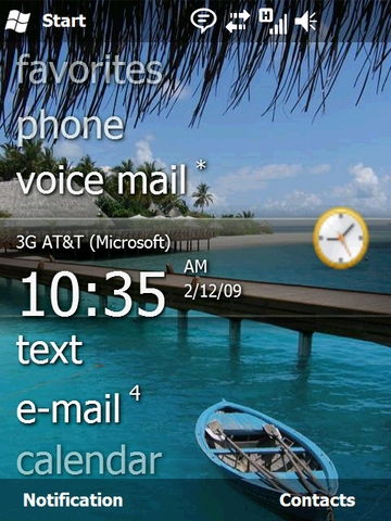
Say hello to Windows Mobile 6.5 - a handful of screen shots from the current alpha code that is. Windows Mobile 6.5 represents a significant departure from previous versions of Windows Mobile in terms of user interface, finger friendliness, and certainly in terms of browser functionality. The screen shot above is the new home screen - and you can see the Zune-like qualities it has. The home screen supports gestures, so you can swipe left or right to drill into certain options.

I'm not sure that home screen is optional, or whether third-party plug-ins will be allowed to modify it, because at first glance my thought is that I can't see my upcoming appointments, which I like having. Love it or hate it, for those that have complained that Windows Mobile has looked the same for years, you can't say that any longer! Check out all the screen shots after the break.

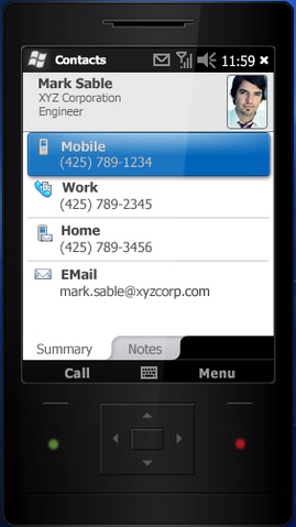
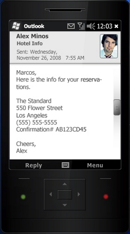
Above we have the new interface for the contacts application (left) and the email application (right). Smoother lines and a much nicer design round out the finger-friendliness of it all.

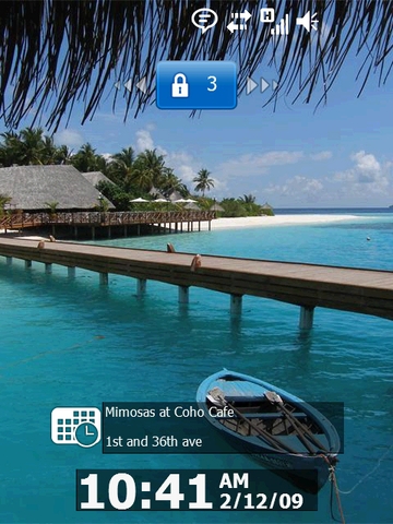
Above we have the new lock screen. It tells you quite a bit of useful information at first glance: the time, network connectivity, and your next appointment (among other things). Clicking and dragging the lock to the left or to the right will unlock the phone.

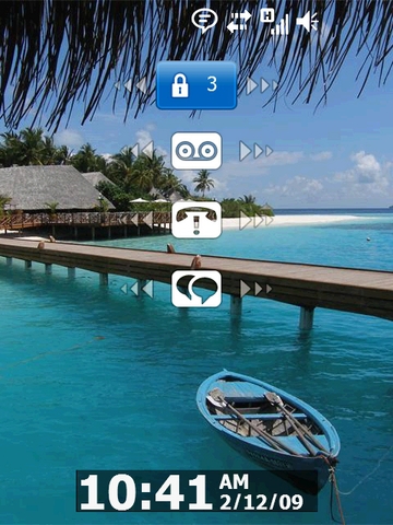
Microsoft goes further than any other phone on the market that I've seen when it comes to the lock screen: if you tap the lock icon, it brings up all the new items on the phone: voice mail, missed calls, text messages, and more. If there are items that you've missed - say a missed call - the icon will indicate it. Even better, if you sweep the icon left or right, it will unlock the phone and activate that application. In the case of voice messages, when you activate the toggle on that icon, it will dial your voice mail number. Nice!

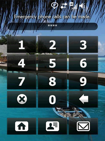
This is the new PIN lock screen - nice and big finger-friendly buttons. I'm not sure what the icons at the bottom do - you wouldn't want someone to be able to access your contacts or email without putting in the PIN. Identification info perhaps?

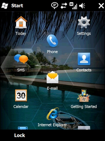
This is the new programs list. The honeycomb design is optimized for finger-friendly usage. In testing they found the honeycomb design gave people the best surface area to successfully hit the program icons. Tapping on a top-level folder, such as Settings, will drill down to one level below.

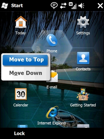
The icons can be moved to the top, or down, with a press and hold function. If you want an icon to be put in the middle, you have to move it to the top, then move it down - one spot at a time - until you get it to where you want it. Unfortunately drag and drop doesn't seem to be supported, which is kind of weak - the iPhone has made that a standard.

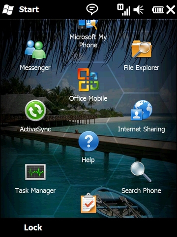
There's Microsoft My Phone, the new phone data backup solution.

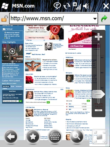
Here's the new Internet Explorer 6 in action. Finally, real browsing on a Windows Mobile device without any third-party software installed! Pretty sad it took this long though. Down in the lower-right corner is the icon that gives you a way to gauge your relative position on the page. Not shown is the fact that you can toggle ActiveX controls off and on. I'm not sure how useful that will be, because you'd have to have an ActiveX control created for an ARM CPU.

The bar on the right zooms in and out on the page - no surprise there. What is a bit of a surprise is the search function is hard-coded in Windows Live Search and apparently can't be changed (we'll see if a registry hack fixes that). When you zoom in, the browser goes full screen to maximize usability.

So when will you see Windows Mobile 6.5 on devices? Windows Mobile 6.5 devices will be out in Q4 of this year, with some 6.0/6.1 phones being upgradable. The latest phones, like the ones being announced today at Mobile World Congress 2009, should be upgradeable to Windows Mobile 6.5 - but whether or not the upgrade is offered is, as always, up to the phone carrier or hardware OEM, and we know how that goes. Bottom line, you can hope for - but shouldn't expect - an upgrade to your device.

So what do you think of what I've shown you of Windows Mobile 6.5 so far?

__________________
Want to contact me personally? Use this. Want to read my personal blog? Check it out. Want to follow me on Twitter? Here you go.
 
Reply With Quote
  #2  
Old 02-16-2009, 05:25 PM
serpico
Intellectual
Join Date: Nov 2007
Posts: 212

It's much improved but that puzzle menu thing is ugly and looks non functional. I think they should have skipped this and gone to ver7. Can't sit around for another year while the Palm Pre and updated iPhone come out this year.
__________________

 
Reply With Quote
  #3  
Old 02-16-2009, 05:46 PM
CTSLICK
Sage
CTSLICK's Avatar
Join Date: Aug 2006
Posts: 601

Changes to the front end UI will be welcome and I agree...where's my upcoming meeting list? More important to me...will they do something to make the entire interface more finger friendly? Anyone who has tried to poke and prod a new calendar appointment into a Windows Mobile device using only a finger will back me on this. It's darn hard and it doesn't have to be. And if they don't re-design to this level then how is 6.5 different than any other shell program I can buy today aside from the fact that it doesn't eat up my RAM?
__________________
CTSLICK - ROCK ON
 
Reply With Quote
  #4  
Old 02-16-2009, 06:27 PM
sundown
Theorist
sundown's Avatar
Join Date: Aug 2006
Posts: 302

So I guess there's no chance this will get ported to my Dell X50v sans-phone features, huh?
 
Reply With Quote
  #5  
Old 02-16-2009, 07:20 PM
robert_biggs
Ponderer
robert_biggs's Avatar
Join Date: Aug 2006
Posts: 113

I sure hope they update the icons and I agree the honeycomb idea is visually unappealing. The whole visual design looks at least 10 years behind the competition (excluding the browser). I would gladly take the new PIE6 as a CAB upgrade to WM6.1. But I'll hold out for WM7 and hope MS can right the ship.

P.S. Why can't Microsoft keep a consistent naming scheme for their mobile OS?
 
Reply With Quote
  #6  
Old 02-16-2009, 09:53 PM
Rocco Augusto
Editor Emeritus
Rocco Augusto's Avatar
Join Date: Aug 2006
Posts: 2,432

I LOVE it but like everyone else I have to question the thought process that went behind adding that honeycomb layout to the Start menu. From what I can see it takes away from how many icons can be on the screen as well as being isolated design wise from the layout of the rest of the operating system. In a way, in its current form, it feels like an idea that some project manager thought would be really awesome and the development team didn't have the heart to tell them "no".

One thing I have learned in life is that pictures can be really deceiving so I will reserve judgment until someone is nice enough to let me play with it. I could see it working if the icons were interactive and the animation was slick and smooth.

I'm excited
__________________
Follow me on Twitter - @therocco
 
Reply With Quote
  #7  
Old 02-17-2009, 02:53 PM
Dyvim
Sage
Dyvim's Avatar
Join Date: Aug 2006
Posts: 676

A couple things that struck me as odd: Look at the IE screenshots. They have these sweet modern-looking buttons on the bottom and zoom bar overlay on the right. Then what's at the top of the screen? The same ugly address bar straight out of the original Pocket PC OS (2000). Couldn't they have spruced that up just a little? It looks glaring to me in contrast to the other improvements.

As for the other screenshots I think the top and bottom bars look more dated (since they seem to be unchanged) now that the content between them has been updated. (I like how they look transparent on the home screen, but elsewhere they're solid and same as ever.)

I don't see much new in Contacts screenshots other than a gloss effect and curved tabs. Looks nicer for sure, but some new "wow" functionality would be nice too (no idea what that would be, just saying...).
__________________
64 GB iPad 2 WiFi, Apple TV 2, 32 GB iPhone 4
Early 2011 MacBook Pro 13" (dual boot with Windows 7), Early 2009 Mac Mini
 
Reply With Quote
  #8  
Old 02-19-2009, 12:55 AM
caywen
Intellectual
Join Date: Feb 2004
Posts: 123
Send a message via MSN to caywen
Default Too little, too late, too slow

These changes are skin deep. Layering a shell on top of a bloated, slow OS is no way to do mobile. The videos I saw showed choppy animation and sluggish browsing.

This should have been WinMo 6, and it should have been delivered 2 years ago.
 
Reply With Quote
  #9  
Old 02-27-2009, 08:27 PM
KuroNeko
Intellectual
Join Date: Feb 2003
Posts: 171

What's the update policy on this OS? I just bought a new Ipaq 214 with 6.0 Classic, as I don't need the phone bit, but the rest of it, especially the internet browser, looks real interesting.

Neko
 
Reply With Quote
Reply


Thread Tools
Display Modes

Posting Rules
You may not post new threads
You may not post replies
You may not post attachments
You may not edit your posts

BB code is On
Smilies are On
[IMG] code is On
HTML code is Off

Forum Jump


All times are GMT +1. The time now is 07:33 PM.