
01-26-2009, 04:48 PM
|
|
Executive Editor

Join Date: Aug 2006
Posts: 29,160
|
|
 OEM Leaks Windows Mobile 6.5 User Interface
"There have been a ton of leaks of Windows Mobile 6.5 on the Internet, and Microsoft is widely expected to announce the new version of Windows Mobile on Feb. 16 at the Mobile World Congress trade show in Barcelona. But today Windows Mobile 6.5 popped up on an official manufacturer's Web site - admittedly, a small manufacturer who hasn't yet successfully put out a product, but they're a manufacturer nonetheless. On Compulab's page for their new Exeda handheld they have a "Windows Mobile 6.5" tab, where they say, "To demonstrate just how friendly to developers exeda is, CompuLab software team brought-up Windows Mobile 6.5 Alpha on exeda the same day it was released."" 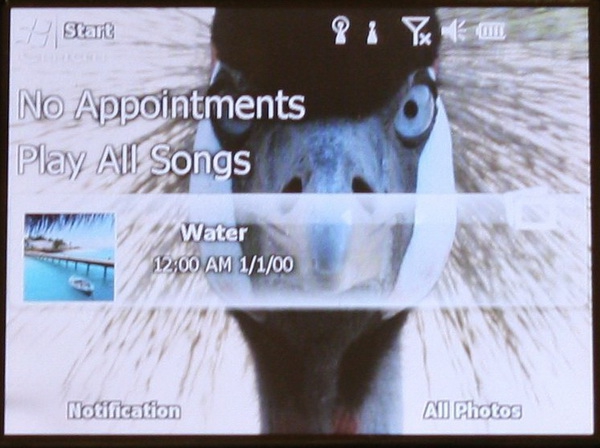
I can't say much more about this due to an NDA I'm under, but the images leaked by this manufacturer speak for themselves. What do you think of what you're seeing above?
|
| |
|
|
|
01-26-2009, 05:15 PM
|
|
Ponderer
Join Date: Jan 2005
Posts: 69
|
|
My feelings can be summed up as: meh.
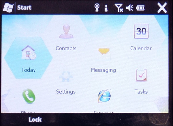
Having used CHOME on my Q9h, I think it is a big improvement to the classic Today screen. However, I am currently spoiled by HTC's Touch 3D interface. Microsoft should hire their deign teams, as they know how to build a sexy UI!
Personally, I do not like the "hex launcher" at all. It makes scanning the list of programs unecessarily cumbersome, as it breaks up the naturel left and right scanning of our eyes.
Code:
It      be    writing    like    .
   would  like       text    this

|
| |
|
|
|
01-26-2009, 05:27 PM
|
|
Thinker

Join Date: Jul 2003
Posts: 468
|
|
The new Today screen certainly looks pretty and is a big improvement over WM 6.1 and earlier. Hopefully it will perform better than HTC's TouchFlow.
As for the hex grid thing, well it looks... interesting. I think I'll reserve judgement until I see it in action. If it makes quick work of finding and launching applications then I'm all for it.
And I still wonder how deep do these new changes go. Is this just another Today screen / program launcher shell and do we have the same old, same old underneath? I know the major changes are in WM 7, but if there's really nothing else new in 6.5 I'll be very underwhelmed.
|
| |
|
|
|
01-26-2009, 05:28 PM
|
|
Thinker
Join Date: Aug 2006
Posts: 403
|
|
Jason,
Has there been any evidence that we will be able to install this on our existing q9h, or other current WM device???
|
| |
|
|
|
01-26-2009, 06:29 PM
|
|
Ponderer
Join Date: Mar 2006
Posts: 99
|
|
It does nothing for me. Hex's just seem to use up space. It seems like I can fit a lot more choices in if I just use tiles. The bird thing...well, I can't say anything nice about it.
|
| |
|
|
|
01-26-2009, 06:33 PM
|
|
Sage

Join Date: Aug 2006
Posts: 676
|
|
I find the hex screenshot hard to believe due to the cropped text on the bottom row of icons. Surely MS wouldn't do that, would they?
I'm not against the hex idea- it's a good way to get finger-friendly icons without having to go with a grid and provides a look that differentiates it from the competition.
I too wonder if the changes go much beyond the home screen. For a dot revision, we probably shouldn't expect too much.
__________________
64 GB iPad 2 WiFi, Apple TV 2, 32 GB iPhone 4
Early 2011 MacBook Pro 13" (dual boot with Windows 7), Early 2009 Mac Mini
|
| |
|
|
|
01-26-2009, 06:44 PM
|
|
Mystic
Join Date: Sep 2006
Posts: 1,608
|
|
I think the UI still looks old. I'm stunned that this is the best they can come up with.
__________________
27" iMac 3.06GHz Intel Core 2 Duo 8GB RAM
16GB LTE iPad3, 13" Macbook Air Core i5 w/128GB SSD
iPhone 4S (16GB), AppleTV 2.0
|
| |
|
|
|
01-26-2009, 06:51 PM
|
|
Contributing Editor

Join Date: Sep 2006
Posts: 524
|
|
Touch interfaces just do not port well to Windows mobile device *in general*. The problem is the huge veriation in dpi!!!
For instance, my i-mate Ultimate 6150 has a 2.8" 480x640 resolution screen. There are some Windows Mobile devices that have 2.8" 240x320 resolution screens. That's one quarter of the dpi as mine!!! So if they're developing finger touchable buttons that will work well on the 240x320 resolution screen, they will be much smaller, four times smaller, on my screen and probably not comfortable to press with the finger.
The iphone has a huge advantage since they all have the same size and resolution. The same applies to the G1 for now at least.
They could work around this by using different bitmaps and layouts for different screen dpi's but this would get complicated and would be confusing to many users if not set by the oem.
So, I'm not saying it can't be done but just trying to point out (ok, this is just my opinion, I'm no developer) that Microsoft or other vendors have a tough job ahead. I actually would not like to loose the stylus for detailed work but a more touch friendly interface would be welcome.
|
| |
|
|
|
01-26-2009, 07:04 PM
|
|
Sage
Join Date: Aug 2006
Posts: 676
|
|
Quote:
Originally Posted by vector

Touch interfaces just do not port well to Windows mobile device *in general*. The problem is the huge veriation in dpi!!!
For instance, my i-mate Ultimate 6150 has a 2.8" 480x640 resolution screen. There are some Windows Mobile devices that have 2.8" 240x320 resolution screens. That's one quarter of the dpi as mine!!! So if they're developing finger touchable buttons that will work well on the 240x320 resolution screen, they will be much smaller, four times smaller, on my screen and probably not comfortable to press with the finger.
|
If this were true, you could barely touch the Start button on your VGA device because it would be so small. But that is not the case because on your device the Start button (and all other major UI elements like the top and bottom bars, menu items, etc.) are drawn with 4x as many pixels (2x width and 2x height) as on a QVGA device so that they occupy the same amount of real estate. I'm sure the same will be true for any finger-friendly elements in WM 6.5.
However, there will be a big difference between a 4" screen and a 2.8" screen regardless of whether either one is VGA or QVGA. Items that are finger friendly on a 4" screen may not be friendly on a 2.8" screen.
__________________
64 GB iPad 2 WiFi, Apple TV 2, 32 GB iPhone 4
Early 2011 MacBook Pro 13" (dual boot with Windows 7), Early 2009 Mac Mini
|
| |
|
|
|
01-26-2009, 07:14 PM
|
|
Intellectual
Join Date: May 2006
Posts: 165
|
|
Quote:
Originally Posted by Dyvim
I find the hex screenshot hard to believe due to the cropped text on the bottom row of icons. Surely MS wouldn't do that, would they?
...
|
From a UI/UX perspective, they need to provide a mechanism for the user to "get to" the next screen of icons, the logical way to do this would be to show part of the next row and provide some mechanism (a flick, or tap and drag, or something) to advance the display to the next row of hexes...
My two-bits...
- www.JoeLevi.com
|
| |
|
|
|
|
|


 Linear Mode

