 Windows Gets Some Touch Friendly Love With FrontFace
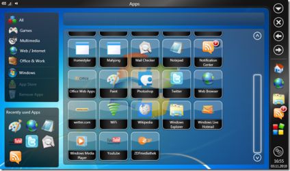
"The interface is more widget or app like with four main areas. The menu along the left handles much used items and folders of links to useful sites based on type with recently used applications below that. The right hand toolbar is buttons for navigating around the interface. The top toolbar shows things like battery levels, Wi-Fi connection strength, and a volume icon as well as the title of the open window. And the main screen contains icons or buttons for all the applications on the computer." 
Microsoft has had a really hard time trying to get Windows to work on the tablet interface. It could be argued that the company has been trying for close to a decade to figure it out. While Apple has had considerable success with iOS and Google has its Android platform, not much has come out of Redmond (unless you count Windows Phone 7, which may be the solution they are looking for) and manufacturers have been struggling to make Windows XP/Vista/7 be more tablet, and in particular, touch friendly. FrontFace looks to be one solution and it reminds me a lot of Ubuntu's Netbook Remix with a few more thoughtful touches. Sadly, as nice as it looks, right now, there are few Windows based notebooks or tablets that can take advantage of the interface FrontFace offers. I can only hope that the company gets the software licensed by a manufacturer for use in a whole line of tablets.
|


 Threaded Mode