 Apple MACronomics: Embracing the Ecosystem

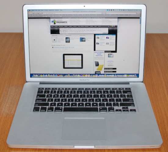
In July I began the journey of moving to the Mac world (refer to the column "Taking the Plunge - Switching to the Apple World"). There were a number of reasons for this, including my perception that the total user experience of using a Mac would exceed that of the Windows platform from which I was moving. Mac travels and the unboxingMy journey began with the ordering of a 15" MacBook Pro with the 2.66GHz Intel Core i7 processor option running OS X Snow Leopard, an upgraded hard drive (the 500 GB 7200-rpm option), the higher-resolution non-glare screen and 8 GB of memory. I ordered Parallels and MobileMe. I also ordered the Magic Mouse and a wireless keyboard. I placed the order online via the Apple Store and 48 hours later the order started to ship from China. Following the order online, I saw the shipment pass through Japan, Alaska, and the US before arriving in Canada, where I'm located on the east coast. First impressions are important, and the unboxing experience left me with a very positive impression of Apple's quality control. From the moment you open the box until you start configuring your new Mac you can see that attention to detail is prevalent. I had one big surprise during the unboxing: my MacBook Pro has a silver metal bezel surrounding the screen as opposed to a solid black as is shown in the pictures online in the Store. I assume this is because I ordered the upgraded screen with higher resolution and the matte (non-glare) finish. Personally, I prefer this option to the black bezel, but it's not a big deal and either would be just fine. 
Figure 1: My new Macbook Pro. Note the silver screen bezel that comes with the non-glare screen. Two other aspects of my initial impression are worth mentioning. First, the construction of the MacBook Pro is outstanding. It simply looks and feels of high quality, with a fit and finish a notch above other laptops that I have used. The seamless metal casing and the texture of the surfaces exude quality and sophistication. Second, the power cord, a seemingly inconsequential part of your hardware, is a great illustration of the design thought that goes into these Apple products. The connector that you plug into the side of your Mac has a magnetic property which helps you find the right location for it without having to look closely. It's a small thing, but if you transport your MacBook around a fair bit you will quickly find that this is one of those little things that works very well. Are these elements important for your computing experience? Well, they are not critical, but they definitely contribute to the total user experience and heighten the pleasure of using the device. Getting set upSetting up the MacBook Pro running OS X Snow Leopard with its initial configuration was straightforward. I was guided through a series of questions regarding my language preference, my location, and so forth, and before long I was seeing the Mac desktop for the first time. I think most people with any amount of computing experience can quickly become functional in almost any windowing environment, and the Mac desktop is no exception. The Dock, which is the application launch bar across the bottom of the screen (by default) holds an appealing representation of the applications you might be interested in using through colorful icons. It is, of course, customizable, and within a short while of using your Mac you'll have it set up in a way that makes sense for you. The Windows 7 taskbar and the Dock are similar in functionality, and at the end of the day both get the job done just fine. After a month of use I do find that I still prefer the design of Windows 7 taskbar, in particular its ability to show you application state previews by hovering your mouse over the icons, and the ability to close windows from those previews. As with many things about the Mac OS X platform, it's the fact that there are subtle differences between it and the Windows platform that it takes you a while to appreciate the overall design. The taskbar/Dock comparison is one example of this, and the more you learn about the features of functionality of the Dock, the more you appreciate it. Experiencing new thingsOne of the exciting things about learning and exploring a new platform is the delight you feel as you find new and interesting features. Like the Windows platform, the Mac is full of these features that are not immediately obvious. The Finder is a great example of this. This is the Mac OS X utility for browsing your file store, and in basic use it is similar to the Windows Explorer or any of the plethora of file management utilities you will find developers providing. It is a very deceptive tool though, in a positive sense. It takes a thorough study of it to unearth the hidden marvels of Quick Look, file and folder views, document information, and more. Two features jump out as being significant and "worth the price of admission". First, folder views can be customized on a folder by folder basis, and, here it is, those customized states are "remembered" consistently. Hopefully you know what I am talking about here - in my experience Windows has struggled to make this work correctly in all releases. Seeing it work on the Mac is just wonderful. The second nice feature of the Finder is the Quick Look preview of files that can be initiated by hitting the space bar (or other keystrokes and mouse clicks). Have you ever noticed how on Windows this just does not work consistently, even for Microsoft's own products? In Windows 7 they have a file preview mode option built into every Windows Explorer window, but in my experience it is frustratingly inconsistent. This is an example of a little productivity boost that when executed successfully makes a big difference in the total user experience. There's a lot more to the Finder, of course, and in later columns I'll be mentioning it again.
The Missing ManualOS X is full of these sorts of "hidden" features that make it a nice platform to work on. I'm the type who likes to explore and understand these sorts of features, so after a few days of learning about my new Mac I realized I wanted a faster way to unearth them. 
Figure 2: A book you might want to consider getting. A visit online to Chapters (our big bookstore chain in Canada) revealed a number of books on the Mac OS X Snow Leopard platform. I was drawn to the O'Reilly book titled "OS X Snow Leopard - the missing manual" (written by David Pogue) based on my past experience working on the Unix platform and having read their reference books. I purchased the title locally at our bricks and mortar Chapters store, and started on page 1 of the 600+ page manual. Wow, what a treat! This book is a treasure trove of information about every conceivable feature in the MacBook Pro's OS X operating system. Written in an engaging fashion, the book speeds the development of your understanding of the whole platform, and I highly recommend you make it a desktop companion within arm's reach of your seat. Likes and DislikesWith the above commentary you can probably already infer that my Mac experiment has gone pretty well and that I am pleased with the journey to date. So, in the following, I will highlight a few more impressions, good and bad, that I have developed. Keyboard - the MacBook Pro keyboard is very comfortable and I can type on it for extended periods of time and enjoy it without strain. Like my previous notebook, a Dell Studio 16, the MacBook Pro has a backlit keyboard that lights the keys in a darkened environment. This is a feature that once you have you will not want to do without (like heated car seats, here in Canada!). I will say, however, that I greatly miss the Home and End keys, and the PgUp and PgDn keys that I've had on all my other keyboards. The MacBook has various key combinations that will provide the same functionality, and once learned, things are not too bad, but given a choice I'd have them as separate keys any day. Non-glare screen - my laptops follow me to numerous client sites and other locations while on the job as a management consultant. I have found in the past that most sites I go to have lighting that reflects strongly off normal laptop screens. This is not only annoying, but requires a constant refinement of the screen angle as you move your position from moment to moment. When I discovered that the MacBook Pro could be ordered with a non-glare, high-resolution, screen I jumped on it. I have not been disappointed. It's amazing how quickly one can forget about glare issues after you move to a matte-finished screen. This MacBook Pro has a slightly lower resolution than my Dell Studio 16 had, but for my primary uses it is just fine. This screen is highly recommended. Quietness - this is another area where the MacBook Pro shines. My Dell Studio 16 was a real workhorse for me, and served me very well. There were a few annoyances with it: it tended to run very hot (i.e., the temperature of the chassis on the underside was often uncomfortably hot), it was quite heavy to carry around, and frequently it needed to turn on (or turn up the speed of) the cooling fans. Were those fans ever noisy - once running at high speed it was impossible to ignore them. By contrast, this MacBook Pro is quiet! Whisper quiet! Again, it's a little thing, but it sure adds to the total user experience to have near silent operation. Suspend/sleep - as Steve Jobs likes to intonate, "it just works". This is another one of those "worth the price of admission things". I can't say enough how nice it is to just get up and leave the Mac to power down on its own, or to get up, close the lid, and head off to the next location. When you open the lid again, or wake the Mac from sleep, it's ready to go. Applications are in the state you expect them to be in, and the system's performance does not seem to be compromised. This is huge. If your Windows experience was like mine, sleep/suspend state was inevitably followed by the need for a reboot. I don't know what exactly the issue is in Windows, but in my experience that feature has never worked properly. It just works on the MacBook Pro running OS X. Parallels - if you read my introductory column you will know that as a longtime Windows user I wanted to transition to the Mac environment with some Windows applications in tow. There are a few ways to accomplish this, but I chose to employ the Parallels virtual machine approach, and I'm pleased to report this is working exceedingly well. 
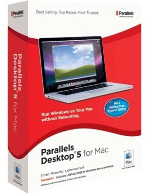
Figure 3: Parallels Desktop 5 for Mac. This software allows you run a complete Windows environment on your Mac. To start you have to install Parallels (which is as easy as installing any other app) and then configure your virtual machine. In my case I have allocated 4 GB for OS X and 4 GB for Windows. Thereafter you install your Windows operating system, following the standard install routine. This took less than 30 minutes, round-trip. Parallels offers a number of operating modes for your virtual machine, including a full-screen mode, a windowed mode, or a "Coherence mode" where the Windows apps appear seamlessly on the Mac desktop alongside the Mac apps. From my experience to date, the full screen mode offers the best performance, essentially indistinguishable from running the laptop as a pure Windows machine. The windowed mode also works well, and I often switch to that mode, depending on if I'm in dual screen or single screen setup. The Coherence mode also works well, provided you don't have to move windows around a lot. Dragging windows around in Coherence mode is a bit slow and laborious, but if you set your windows to your preferred size and location and don't modify them much, then Coherence mode is a nice way to work. External keyboard/mouse - Since I knew I would be using my MacBook Pro with an external monitor in a quasi-docked state, I ordered the wireless Apple keyboard and Magic Mouse. As you will probably know, keyboards and mice are very personal experiences, and people tend to love a particular feel. From my perspective I find the wireless keyboard a pleasure to type on and would recommend it. As with the MacBook Pro's keyboard, it's missing some keys I'd like it to have, but this issue is surmounted shortly by learning new combination keystrokes. The small, metallic feel of the keyboard grows on you and in short order you can type efficiently. From my readings of forums and review sites the Magic Mouse is a bit controversial. Some love it, others not so much. I have found that when working on native Mac apps I love its design and performance. Scrolling through websites with just a flick of a finger across the top of the mouse is very effective. Unfortunately, the mouse behavour is not as good, in my opinion, when using it with Windows apps under Parallels. For some reason the mouse pointer tends to jump around from place to place in your document at random times if you even lightly brush the mouse. This is especially disconcerting while working in Microsoft PowerPoint, where you can be happily editing a slide, and then a moment later looking at the slide 3 slides earlier in your deck. This is likely related to the Windows mouse driver employed, but so far I've not been able to resolve this (if anyone has any ideas please let me know in the comments).
Minor QuibblesI have yet to encounter any significant show stoppers in my journey. I have a few minor quibbles, which primarily relate to the fact that there are many ways to implement operating system features, and there are few hard and fast conventions. The whole treatment of window behavior and style is different in OS X than in Windows world. The main application menus, for example, in the Mac OS X world are tied to the top of the desktop screen, and switch as you click in different application windows that are floating on the desktop. In the Windows world the application menu is tied to the window itself, and moves with it as you resize and move the application window. Both approaches work, they are just different from each other, and coming from one environment or the other challenges your familiarity and expectations in the other. The OS X window "control" buttons (the buttons with "x", "+", and "-" signs) have slightly different behaviors in the Mac world than the Windows world: "x" closes an application window in OS X, but does not quit the application, and the "+" seems to maximize the size of the application window based on the content in the window, not maximizing it relative to the desktop itself. Plunging DeeperSo, where has all this left me? My first comment would be that a long-time Windows user can readily make the transition to the Mac OS X world with few issues. With that transition you can make significant gain in your total user experience. What's more, in many respects I find the Windows on OS X under Parallels combination to be a "better Windows than Windows" (remember those old OS/2 commercials from IBM?). As my comfort and satisfaction with the Mac world has grown my interest in going further with it has increased in lockstep. Since we needed to replace an aging desktop computer used at home for general business and family use, I decided to purchase an iMac. This was delivered about 10 days ago and is now configured on the home network (more on this in a future column). About the same time, my wife's 4.5 year old BlackBerry stopped working, and we decided to replace it with an iPhone 4. We are just starting to appreciate new aspects of a more extended Apple world, and are pleasantly surprised by the MACronomics of our new environment. Many people will acknowledge that there is a premium to be paid for Apple hardware. Based on my experience so far, that premium is worth it for the increase in total user experience that I have observed. The journey has been most enjoyable so far. Along the journey so far I have discovered a few gems, some based in the Mac world (Pixelmator is one) and some in the iPhone world. In future columns I will continue to write about my experiences as I learn more about these platforms. Has your experience echoed mine? I'd be interested in any of your comments about your Apple experiences and how you are maximizing the use of your Apple products. Brad Wasson is a self-confessed technology lover and management consultant living in Atlantic Canada. Brad is presently transitioning to the Mac world and is bringing along all his photos, video, and other digital media. He figures he has some work to do to bring along his wife, daughter and son, and Sheltie, but he's up to the challenge! 
Do you enjoy using new hardware, software and accessories, then sharing your experience with others? Then join us on the Thoughts Media Review Team! We're looking for individuals who find it fun to test new gear and give their honest opinions about the experience. It's a volunteer role with some great perks. Interested? Then click here for more information. 
|